Shopify Polaris
Shopify Polaris / 2017– / Estilo / Lenguajes de pantalla
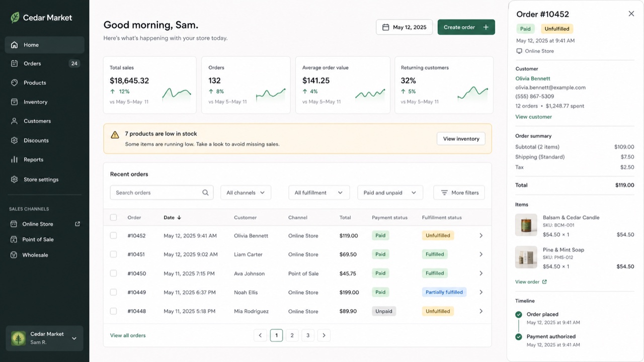
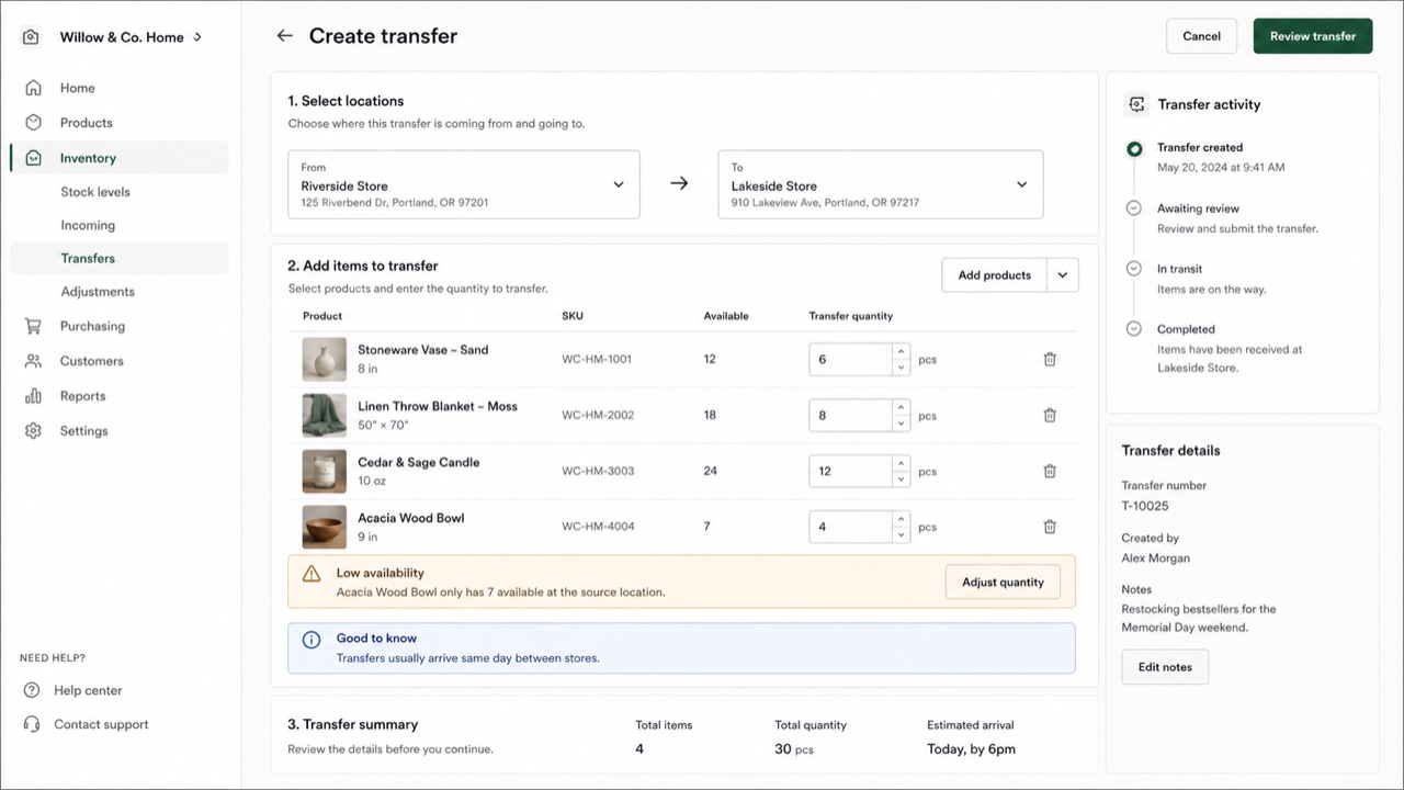
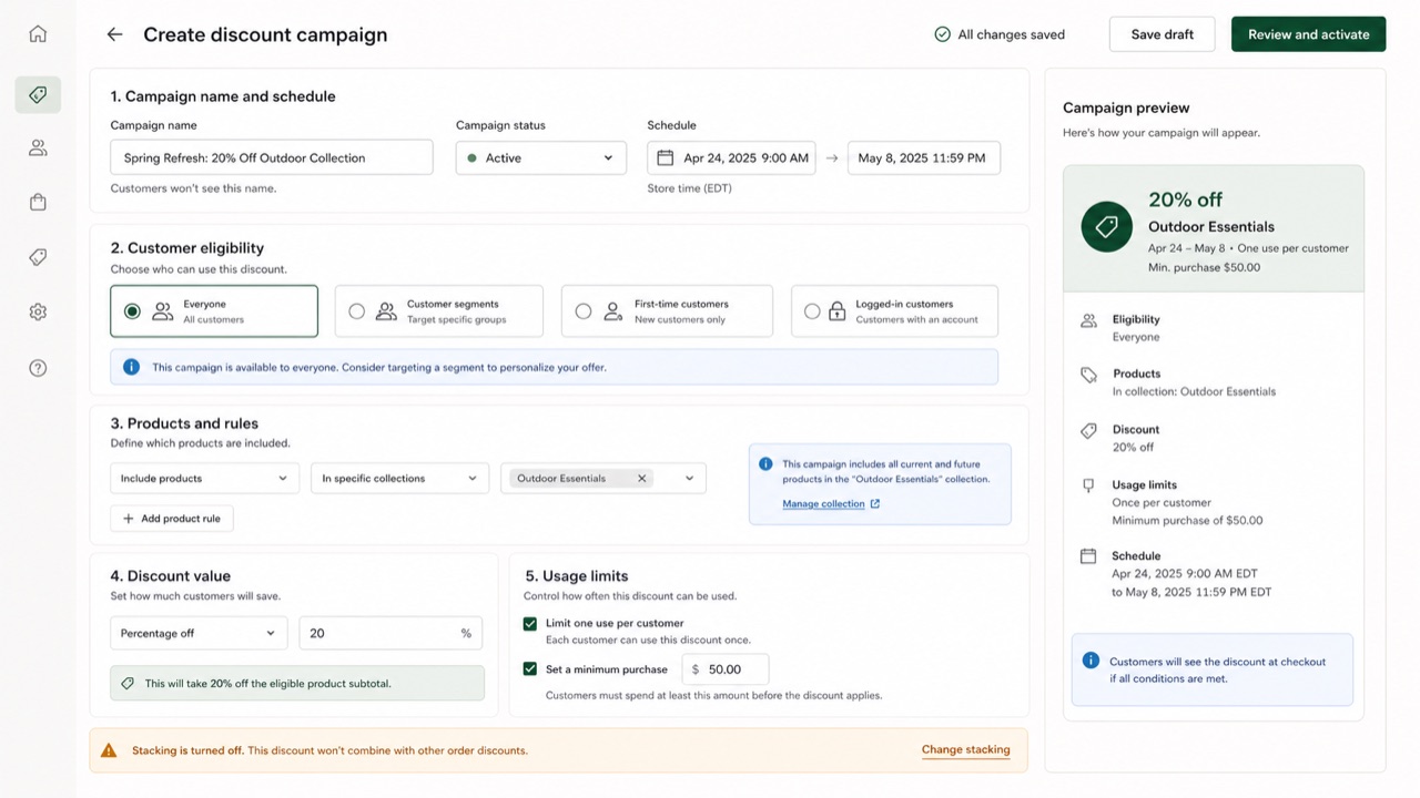
El marco de interfaz de Shopify unifica productos, pedidos, pagos y clientes en un mismo lenguaje comercial. Tarjetas y secciones separan las decisiones, mientras estados y acciones breves ayudan a mantener la tienda en marcha.
De un vistazo
Rasgos visuales
- Tarjetas blancas apiladas sobre un fondo claro
- Verde usado como señal de éxito o avance
- Título, estado y acción principal reunidos en la parte superior
- Insignias compactas para los estados de producto, pedido y pago
Usos idóneos
- Management screens that connect order status to the next operational action
- Giving business tools a calm, humane voice without losing rigor
Usar este estilo
Lleva el resumen al proyecto o entrega la especificación estructurada a una herramienta de IA.
Guía detallada y fuentesReglas de producción, obras de referencia, comparaciones, investigación y citas
Entrada del diccionario
- Tipografía
- Lead with the page title and primary action; split status and explanation into badge and body text.
- Composición
- Stack white cards on a pale ground, with one business decision per card.
- Material
- Use neutrals as the base, green for success and progress, and red only for danger.
- Precaución
- Putting everything in a card removes the order of the page. Define the workflow and primary action outside the cards first.
- Para profundizar
- Shopify admin page structure / Commerce status labels / Polaris as Web Components
Entradas relacionadas
- Atlassian Design System (Atlassian Design System)Misma familia: Lenguajes de pantalla.Comparar Shopify Polaris y Atlassian Design System
- Bento Grid (ベントーグリッド)Efectos compartidos: Trust / Intimacy / Technique.Comparar Shopify Polaris y Bento Grid
Más de Lenguajes de pantalla
Continúa con estilos de Lenguajes de pantalla, priorizados por sus efectos compartidos.
- Salesforce Lightning Design System (Salesforce Lightning)Efectos compartidos: Trust / Technique / Intimacy.
- Ubuntu Yaru (Ubuntu Yaru)Efectos compartidos: Technique / Intimacy / Trust.
- Motif (モチーフ)Efectos compartidos: Technique / Trust.
Ver todas las entradas de Lenguajes de pantalla
Citar esta entrada
El diccionario existe para que se enlace. Toma la forma que encaje donde estés escribiendo.
- Link
- https://indexstyle.org/es/styles/shopify-polaris
- Markdown
- [Shopify Polaris — IndexStyle](https://indexstyle.org/es/styles/shopify-polaris)
- HTML
- <a href="https://indexstyle.org/es/styles/shopify-polaris">Shopify Polaris — IndexStyle</a>