Bento Grid vs Shopify Polaris
ベントーグリッド / Shopify Polaris
Bento Grid comes from Information Design and Shopify Polaris from Platform Screen Languages. One is layout and the other style. They are reached for with some of the same intent, which is where they get confused.
Bento Grid
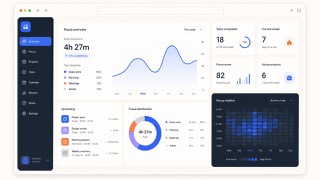
Divides different kinds of information into independent boxes, giving the whole picture at a glance.
Shopify Polaris
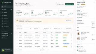
Shopify's UI framework for giving products, orders, payments and customers one commerce language. Cards and sections separate decisions, while short status and action language helps a merchant keep the store moving.
| Bento Grid | Shopify Polaris | |
|---|---|---|
| Era | 2020s | 2017– |
| Family | Information Design | Platform Screen Languages |
| Kind | Layout | Style |
| Cues | Cards large and small / Aligned gutters / One-screen summary / Modules | White cards stacked on a pale ground / Green used as success or forward motion / Title, status and primary action gathered at the top / Compact badges for product, order and payment states |
| Best used for | Presenting many features as one story · Staying friendly while keeping density | Management screens that connect order status to the next operational action · Giving business tools a calm, humane voice without losing rigor |
| Type | A plain sans; oversize the numbers and short headings | Lead with the page title and primary action; split status and explanation into badge and body text. |
| Composition | Tile large and small cards on four to six columns | Stack white cards on a pale ground, with one business decision per card. |
| Material | Vary each card's role; keep decoration inside the cards | Use neutrals as the base, green for success and progress, and red only for danger. |
| Caution | Not every card equal. Vary area and density by importance. | Putting everything in a card removes the order of the page. Define the workflow and primary action outside the cards first. |