Shopify Polaris
Shopify Polaris / 2017– / Style / Langages d'écran
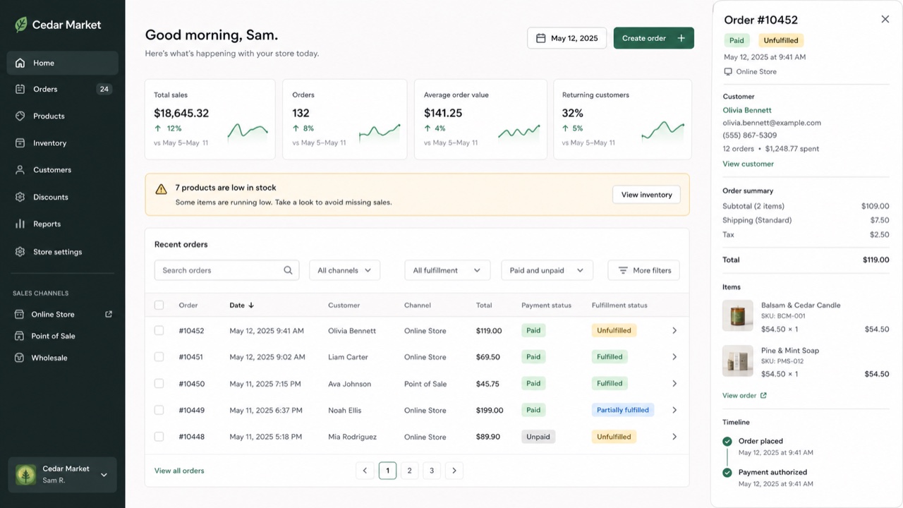
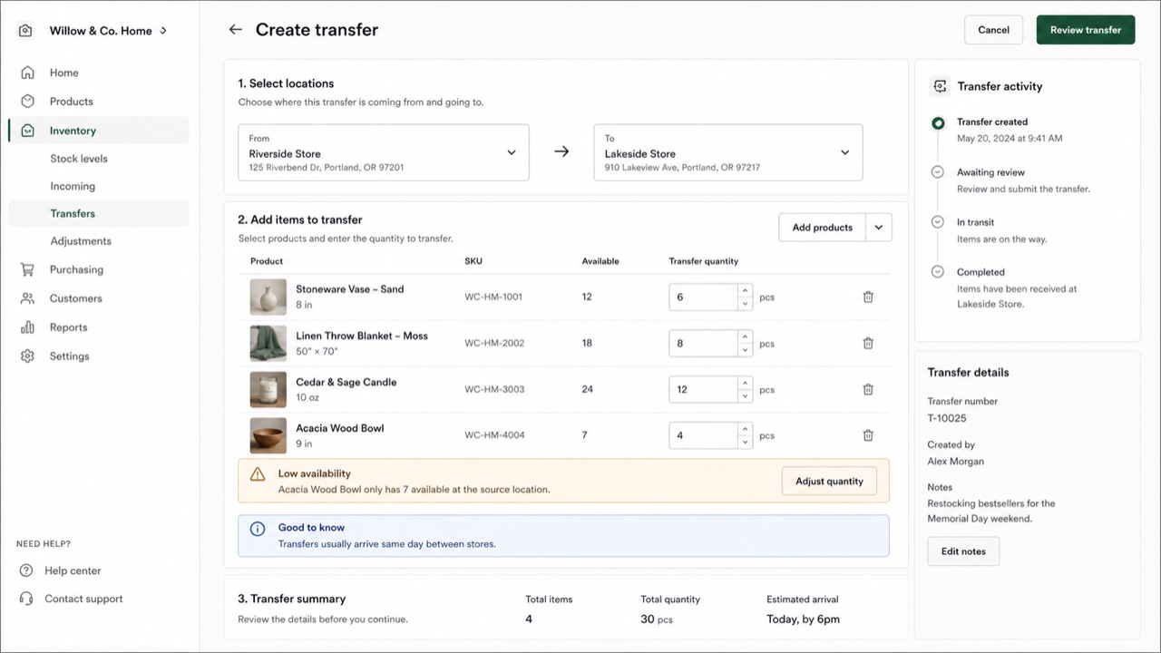
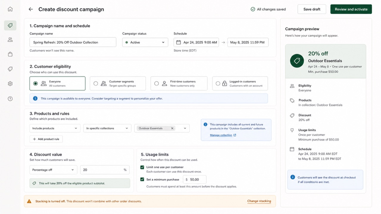
Le cadre d'interface de Shopify donne aux produits, commandes, paiements et clients un même langage commercial. Cartes et sections séparent les décisions, tandis que des états et des actions formulés brièvement aident le marchand à faire avancer sa boutique.
En un coup d’œil
Signes visuels
- Des cartes blanches empilées sur un fond pâle
- Le vert utilisé comme signal de réussite ou de progression
- Titre, état et action principale réunis en haut de page
- Des badges compacts pour les états des produits, commandes et paiements
Usages idéaux
- Management screens that connect order status to the next operational action
- Giving business tools a calm, humane voice without losing rigor
Utiliser ce style
Appliquez le brief concis au projet ou transmettez la spécification structurée à un outil d’IA.
Guide détaillé et sourcesRègles de production, œuvres de référence, comparaisons, recherche et citations
Entrée du dictionnaire
- Typographie
- Lead with the page title and primary action; split status and explanation into badge and body text.
- Composition
- Stack white cards on a pale ground, with one business decision per card.
- Matière
- Use neutrals as the base, green for success and progress, and red only for danger.
- Précaution
- Putting everything in a card removes the order of the page. Define the workflow and primary action outside the cards first.
- Pour approfondir
- Shopify admin page structure / Commerce status labels / Polaris as Web Components
Entrées liées
- Atlassian Design System (Atlassian Design System)Même famille : Langages d'écran.Comparer Shopify Polaris et Atlassian Design System
- Bento Grid (ベントーグリッド)Effets partagés : Trust / Intimacy / Technique.Comparer Shopify Polaris et Bento Grid
Plus de Langages d'écran
Poursuivez avec des styles de Langages d'écran, classés par effets communs.
- Salesforce Lightning Design System (Salesforce Lightning)Effets partagés : Trust / Technique / Intimacy.
- Ubuntu Yaru (Ubuntu Yaru)Effets partagés : Technique / Intimacy / Trust.
- Motif (モチーフ)Effets partagés : Technique / Trust.
Voir toutes les entrées Langages d'écran
Citer cette entrée
Le dictionnaire est fait pour être lié. Prenez la forme qui convient là où vous écrivez.
- Link
- https://indexstyle.org/fr/styles/shopify-polaris
- Markdown
- [Shopify Polaris — IndexStyle](https://indexstyle.org/fr/styles/shopify-polaris)
- HTML
- <a href="https://indexstyle.org/fr/styles/shopify-polaris">Shopify Polaris — IndexStyle</a>