Atlassian Design System vs Shopify Polaris
Atlassian Design System / Shopify Polaris
Both sit in Platform Screen Languages, so the question is not what they belong to but how they behave. They are reached for with some of the same intent, which is where they get confused.
Atlassian Design System
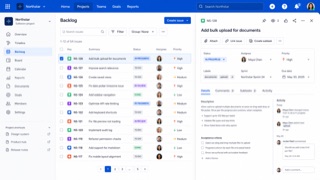
A system that translates the complexity of Jira and Confluence into shared tokens, content rules, spacing, grids and components. Consistency builds trust while keeping large sets of issues, documents and states navigable.
Shopify Polaris
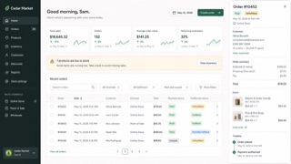
Shopify's UI framework for giving products, orders, payments and customers one commerce language. Cards and sections separate decisions, while short status and action language helps a merchant keep the store moving.
| Atlassian Design System | Shopify Polaris | |
|---|---|---|
| Era | 2012– | 2017– |
| Family | Platform Screen Languages | Platform Screen Languages |
| Kind | Style | Style |
| Cues | White and pale gray layers with blue primary actions / Rounded cards and lozenge-shaped status labels / Clear divisions among sidebar, table and detail pane / Color, spacing, radius and elevation controlled by tokens | White cards stacked on a pale ground / Green used as success or forward motion / Title, status and primary action gathered at the top / Compact badges for product, order and payment states |
| Best used for | Work-management products where people move repeatedly between lists and details · Keeping a trusted family resemblance across products without hiding their complexity | Management screens that connect order status to the next operational action · Giving business tools a calm, humane voice without losing rigor |
| Type | Fix the steps for headings, body and labels; keep status names short inside lozenges. | Lead with the page title and primary action; split status and explanation into badge and body text. |
| Composition | Keep navigation, list and detail roles stable; use token multiples for spacing. | Stack white cards on a pale ground, with one business decision per card. |
| Material | Use white and pale gray as the base, blue for primary actions and one semantic meaning per status color. | Use neutrals as the base, green for success and progress, and red only for danger. |
| Caution | Too many cards and status labels give every component equal force and hide the work that matters next. | Putting everything in a card removes the order of the page. Define the workflow and primary action outside the cards first. |