GitHub Primer
GitHub Primer / 2017– / 风格 / 平台界面语言
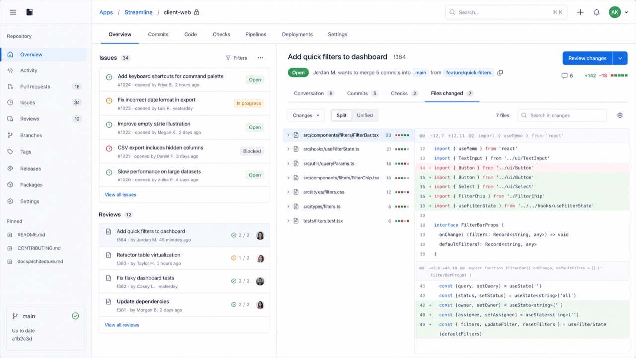
GitHub 的设计系统把密集的开发流程转化为颜色、字体、图标、间距与组件的共同规则。它让流程先于装饰,在狭小空间里容纳大量状态与操作,同时不牺牲无障碍和响应式表现。


快速判断
视觉特征
- 中性色表面、蓝色链接与克制的状态色
- Octicon 图标配以简短的操作标签
- 用细边线分开列表、标签页与侧栏
- 即使信息密集,字号与间距仍遵循一致的级差
适用场景
- Developer SaaS and admin tools that must hold many states and actions on one screen
- Keeping information density and accessibility consistent across product teams
使用这一风格
把简短指引带入项目,或将结构化规格交给AI工具。
详细方法与出处制作规则、真实案例、比较、研究与引用格式
辞典词条
- 字体
- Use one plain sans for body and labels; build hierarchy through weight and color.
- 版面
- Separate lists, tabs and sidebars with fine rules and hold spacing to a small token set.
- 材料
- Start from neutrals; reserve blue for links and semantic colors for success, warning and danger.
- 注意
- Adding borders and tiny controls to look like GitHub only creates a cramped admin screen when the work has no clear priority.
- 延伸阅读
- Primer product principles / Octicons and semantic meaning / Responsive design at high density
相关词条
- Swiss (スイス・スタイル)共同感受:Trust / Calm。比较GitHub Primer与Swiss
- GOV.UK Design System (GOV.UK デザインシステム)同属平台界面语言。比较GitHub Primer与GOV.UK Design System
继续浏览平台界面语言
从平台界面语言中按共同感受优先推荐以下词条。
- Adwaita (アドワイタ)共同感受:Technique / Calm / Trust。
- Breeze (ブリーズ)共同感受:Technique / Calm / Trust。
- Adobe Spectrum (Adobe Spectrum)共同感受:Technique / Trust / Calm。
引用此条目
这部辞典就是用来被链接的。请取用适合你写作场合的那一种形式。
- Link
- https://indexstyle.org/zh/styles/github-primer
- Markdown
- [GitHub Primer — IndexStyle](https://indexstyle.org/zh/styles/github-primer)
- HTML
- <a href="https://indexstyle.org/zh/styles/github-primer">GitHub Primer — IndexStyle</a>