GitHub Primer
GitHub Primer / 2017– / Stil / Bildschirmsprachen
GitHubs Designsystem übersetzt dichte Entwicklungsabläufe in gemeinsame Regeln für Farbe, Schrift, Icons, Abstände und Komponenten. Es bevorzugt den Arbeitsfluss gegenüber Dekoration und hält viele Zustände und Aktionen auf engem Raum, ohne Barrierefreiheit oder responsive Anpassung aufzugeben.


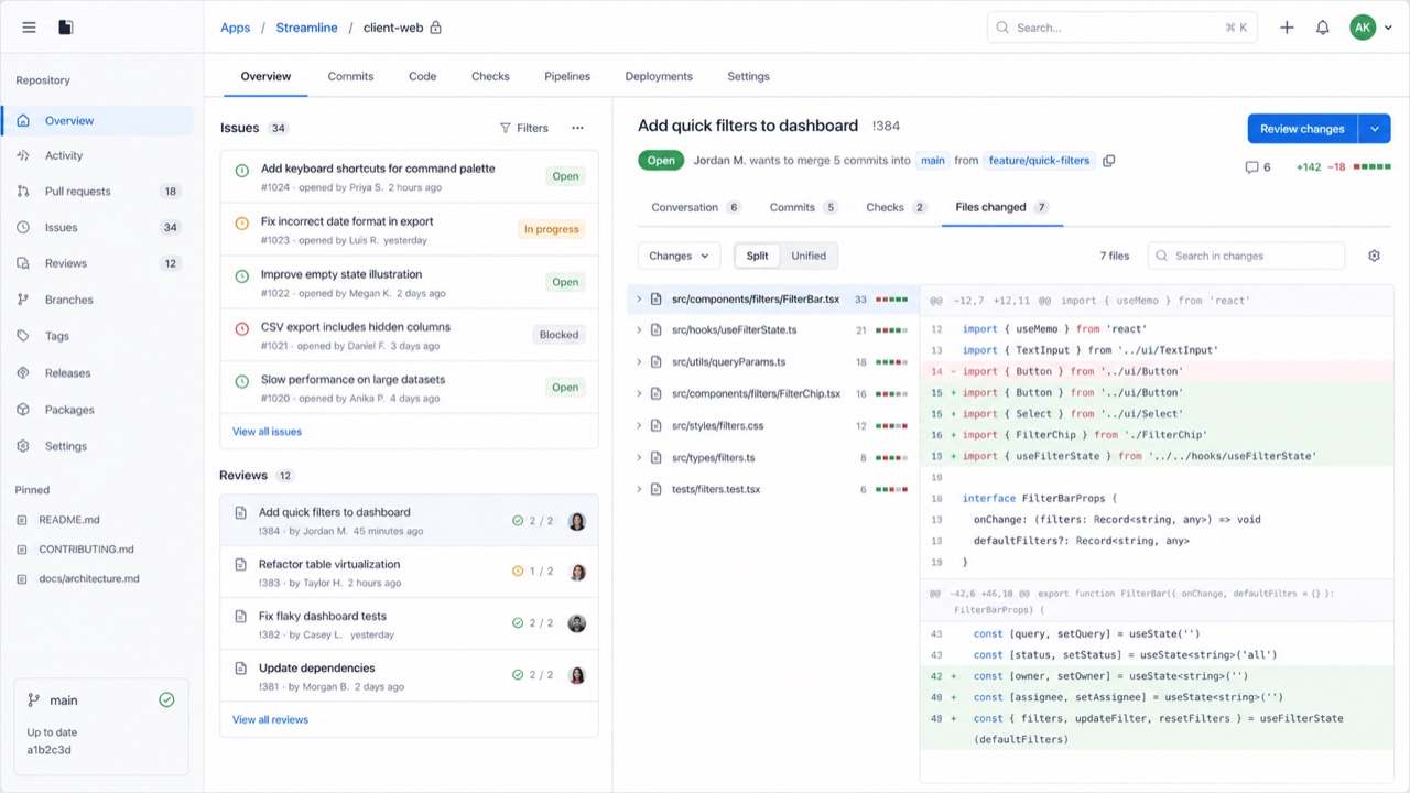
Auf einen Blick
Visuelle Merkmale
- Neutrale Flächen mit blauen Links und zurückhaltenden Statusfarben
- Octicons zusammen mit kurzen Aktionsbezeichnungen
- Feine Linien trennen Listen, Tabs und Seitenleisten
- Gleichmäßige Stufen für Schrift und Abstände auch bei hoher Dichte
Geeignet für
- Developer SaaS and admin tools that must hold many states and actions on one screen
- Keeping information density and accessibility consistent across product teams
Diesen Stil verwenden
Nutze das Kurzbriefing im Projekt oder übergib die strukturierte Spezifikation an ein KI-Werkzeug.
Ausführliche Anleitung und QuellenProduktionsregeln, Referenzwerke, Vergleiche, Forschung und Zitate
Wörterbucheintrag
- Typografie
- Use one plain sans for body and labels; build hierarchy through weight and color.
- Komposition
- Separate lists, tabs and sidebars with fine rules and hold spacing to a small token set.
- Material
- Start from neutrals; reserve blue for links and semantic colors for success, warning and danger.
- Zu vermeiden
- Adding borders and tiny controls to look like GitHub only creates a cramped admin screen when the work has no clear priority.
- Zum Weiterlesen
- Primer product principles / Octicons and semantic meaning / Responsive design at high density
Verwandte Einträge
- Swiss (スイス・スタイル)Gemeinsame Wirkungen: Trust / Calm.GitHub Primer und Swiss vergleichen
- GOV.UK Design System (GOV.UK デザインシステム)Gleiche Familie: Bildschirmsprachen.GitHub Primer und GOV.UK Design System vergleichen
Mehr aus Bildschirmsprachen
Weitere Stile aus Bildschirmsprachen, nach gemeinsamen Wirkungen geordnet.
- Adwaita (アドワイタ)Gemeinsame Wirkungen: Technique / Calm / Trust.
- Breeze (ブリーズ)Gemeinsame Wirkungen: Technique / Calm / Trust.
- Adobe Spectrum (Adobe Spectrum)Gemeinsame Wirkungen: Technique / Trust / Calm.
Alle Einträge aus Bildschirmsprachen ansehen
Diesen Eintrag zitieren
Das Wörterbuch ist zum Verlinken gedacht. Nehmen Sie die Form, die dorthin passt, wo Sie schreiben.
- Link
- https://indexstyle.org/de/styles/github-primer
- Markdown
- [GitHub Primer — IndexStyle](https://indexstyle.org/de/styles/github-primer)
- HTML
- <a href="https://indexstyle.org/de/styles/github-primer">GitHub Primer — IndexStyle</a>