GitHub Primer
GitHub Primer / 2017– / Style / Langages d'écran
Le système de design de GitHub transforme les flux de développement denses en règles communes de couleur, de typographie, d'icônes, d'espacement et de composants. Il privilégie l'avancement du travail plutôt que l'ornement et maintient de nombreux états et actions dans peu d'espace sans renoncer à l'accessibilité ni à l'adaptation aux écrans.


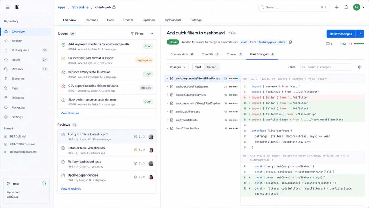
En un coup d’œil
Signes visuels
- Des surfaces neutres, des liens bleus et des couleurs d'état retenues
- Des Octicons accompagnés de libellés d'action courts
- De fins filets séparant listes, onglets et barres latérales
- Des degrés constants de typographie et d'espacement même à forte densité
Usages idéaux
- Developer SaaS and admin tools that must hold many states and actions on one screen
- Keeping information density and accessibility consistent across product teams
Utiliser ce style
Appliquez le brief concis au projet ou transmettez la spécification structurée à un outil d’IA.
Guide détaillé et sourcesRègles de production, œuvres de référence, comparaisons, recherche et citations
Entrée du dictionnaire
- Typographie
- Use one plain sans for body and labels; build hierarchy through weight and color.
- Composition
- Separate lists, tabs and sidebars with fine rules and hold spacing to a small token set.
- Matière
- Start from neutrals; reserve blue for links and semantic colors for success, warning and danger.
- Précaution
- Adding borders and tiny controls to look like GitHub only creates a cramped admin screen when the work has no clear priority.
- Pour approfondir
- Primer product principles / Octicons and semantic meaning / Responsive design at high density
Entrées liées
- Swiss (スイス・スタイル)Effets partagés : Trust / Calm.Comparer GitHub Primer et Swiss
- GOV.UK Design System (GOV.UK デザインシステム)Même famille : Langages d'écran.Comparer GitHub Primer et GOV.UK Design System
Plus de Langages d'écran
Poursuivez avec des styles de Langages d'écran, classés par effets communs.
- Adwaita (アドワイタ)Effets partagés : Technique / Calm / Trust.
- Breeze (ブリーズ)Effets partagés : Technique / Calm / Trust.
- Adobe Spectrum (Adobe Spectrum)Effets partagés : Technique / Trust / Calm.
Voir toutes les entrées Langages d'écran
Citer cette entrée
Le dictionnaire est fait pour être lié. Prenez la forme qui convient là où vous écrivez.
- Link
- https://indexstyle.org/fr/styles/github-primer
- Markdown
- [GitHub Primer — IndexStyle](https://indexstyle.org/fr/styles/github-primer)
- HTML
- <a href="https://indexstyle.org/fr/styles/github-primer">GitHub Primer — IndexStyle</a>