GitHub Primer
GitHub Primer / 2017– / Estilo / Lenguajes de pantalla
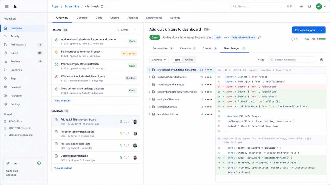
El sistema de diseño de GitHub convierte flujos de desarrollo densos en reglas compartidas de color, tipografía, iconos, espaciado y componentes. Da prioridad al avance del trabajo frente al adorno y mantiene muchos estados y acciones en poco espacio sin renunciar a la accesibilidad ni a la adaptación entre pantallas.


De un vistazo
Rasgos visuales
- Superficies neutras con enlaces azules y colores de estado contenidos
- Octicons acompañados de etiquetas de acción breves
- Bordes finos que separan listas, pestañas y barras laterales
- Escalas constantes de tipografía y espaciado incluso con alta densidad
Usos idóneos
- Developer SaaS and admin tools that must hold many states and actions on one screen
- Keeping information density and accessibility consistent across product teams
Usar este estilo
Lleva el resumen al proyecto o entrega la especificación estructurada a una herramienta de IA.
Guía detallada y fuentesReglas de producción, obras de referencia, comparaciones, investigación y citas
Entrada del diccionario
- Tipografía
- Use one plain sans for body and labels; build hierarchy through weight and color.
- Composición
- Separate lists, tabs and sidebars with fine rules and hold spacing to a small token set.
- Material
- Start from neutrals; reserve blue for links and semantic colors for success, warning and danger.
- Precaución
- Adding borders and tiny controls to look like GitHub only creates a cramped admin screen when the work has no clear priority.
- Para profundizar
- Primer product principles / Octicons and semantic meaning / Responsive design at high density
Entradas relacionadas
- Swiss (スイス・スタイル)Efectos compartidos: Trust / Calm.Comparar GitHub Primer y Swiss
- GOV.UK Design System (GOV.UK デザインシステム)Misma familia: Lenguajes de pantalla.Comparar GitHub Primer y GOV.UK Design System
Más de Lenguajes de pantalla
Continúa con estilos de Lenguajes de pantalla, priorizados por sus efectos compartidos.
- Adwaita (アドワイタ)Efectos compartidos: Technique / Calm / Trust.
- Breeze (ブリーズ)Efectos compartidos: Technique / Calm / Trust.
- Adobe Spectrum (Adobe Spectrum)Efectos compartidos: Technique / Trust / Calm.
Ver todas las entradas de Lenguajes de pantalla
Citar esta entrada
El diccionario existe para que se enlace. Toma la forma que encaje donde estés escribiendo.
- Link
- https://indexstyle.org/es/styles/github-primer
- Markdown
- [GitHub Primer — IndexStyle](https://indexstyle.org/es/styles/github-primer)
- HTML
- <a href="https://indexstyle.org/es/styles/github-primer">GitHub Primer — IndexStyle</a>