Genericana vs Minimalism
ジェネリカーナ / ミニマリズム
Genericana comes from Contemporary Branding and Minimalism from Functionalism. They are reached for with some of the same intent, which is where they get confused.
Genericana
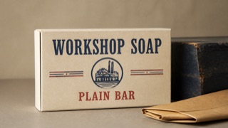
A contemporary brand style that edits 1920s–50s American packaging, sign painting, and factory labels into regionally nonspecific authenticity. Wide space and premium materials turn an imagined old shop into a current upscale product.
Minimalism
%201%E2%80%935%20(1987)%2C%20Tate%20Modern%2C%20London%2C%20UK.jpg)
Removes elements to maximize the meaning and tension of what remains.
| Genericana | Minimalism | |
|---|---|---|
| Era | mid-1980s–early 2010s | 1960s– |
| Family | Contemporary Branding | Functionalism |
| Kind | Style | Style |
| Cues | Heavy sign-painted type and small origin-like labels / Simplified shields, ribbons, stars, and factory seals / Ecru, navy, red, and kraft-brown limited palettes / One vintage packaging image isolated in broad space | Vast white space / Few elements / Quiet color / Precise spacing |
| Best used for | Giving food, clothing, or household goods an old-shop sense of trust · Unifying packaging and signs as an imagined historic main street | Focusing attention on a single value · Letting quality speak quietly |
| Type | Set the main name in a heavy hand-painted roman or script and surround it with small capitals for place, date, and variety. | A light sans-serif or a well-cut serif |
| Composition | Center one emblem or product image and stack short information symmetrically above and below. | One message, one focal point, wide margins |
| Material | Use uncoated paper, embossing, two spot colors, and dark painted wood; confine distressing to edges. | Nearly achromatic; texture in exactly one place |
| Caution | Do not invent a founding year or origin as fact. Separate stylistic quotation from a brand’s documented history. | Missing information is not minimal. Decide priorities before you cut. |