Genericana vs Sign Painting
ジェネリカーナ / サインペインティング
Genericana comes from Contemporary Branding and Sign Painting from Lettering. One is style and the other technique. They are reached for with some of the same intent, which is where they get confused.
Genericana
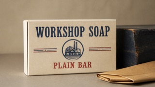
A contemporary brand style that edits 1920s–50s American packaging, sign painting, and factory labels into regionally nonspecific authenticity. Wide space and premium materials turn an imagined old shop into a current upscale product.
Sign Painting
.jpg)

A trade that paints commercial lettering with brush and paint straight onto buildings and windows, giving the street a lettering that carries the trace of a hand.
| Genericana | Sign Painting | |
|---|---|---|
| Era | mid-1980s–early 2010s | 19th century– |
| Family | Contemporary Branding | Lettering |
| Kind | Style | Technique |
| Cues | Heavy sign-painted type and small origin-like labels / Simplified shields, ribbons, stars, and factory seals / Ecru, navy, red, and kraft-brown limited palettes / One vintage packaging image isolated in broad space | Strokes that keep the brush / Shades and outlines / One-shot strokes / Improvised to the site |
| Best used for | Giving food, clothing, or household goods an old-shop sense of trust · Unifying packaging and signs as an imagined historic main street | Painting a shop name straight onto glass or fascia at opening · Giving a neighborhood bar or cafe a warmth mass-produced logos cannot reach |
| Type | Set the main name in a heavy hand-painted roman or script and surround it with small capitals for place, date, and variety. | Casual script paired with fat roman, stretched by hand to fit |
| Composition | Center one emblem or product image and stack short information symmetrically above and below. | Measure the panel first, then set address and phone smaller below |
| Material | Use uncoated paper, embossing, two spot colors, and dark painted wood; confine distressing to edges. | One-shot enamel laid in a single pass, shaded and outlined |
| Caution | Do not invent a founding year or origin as fact. Separate stylistic quotation from a brand’s documented history. | Adding wobble afterwards as an effect kills the tension of the single pass, and the sign reads as a stretched handwriting font. |