Atlassian Design System
Atlassian Design System / 2012– / Style / Langages d'écran
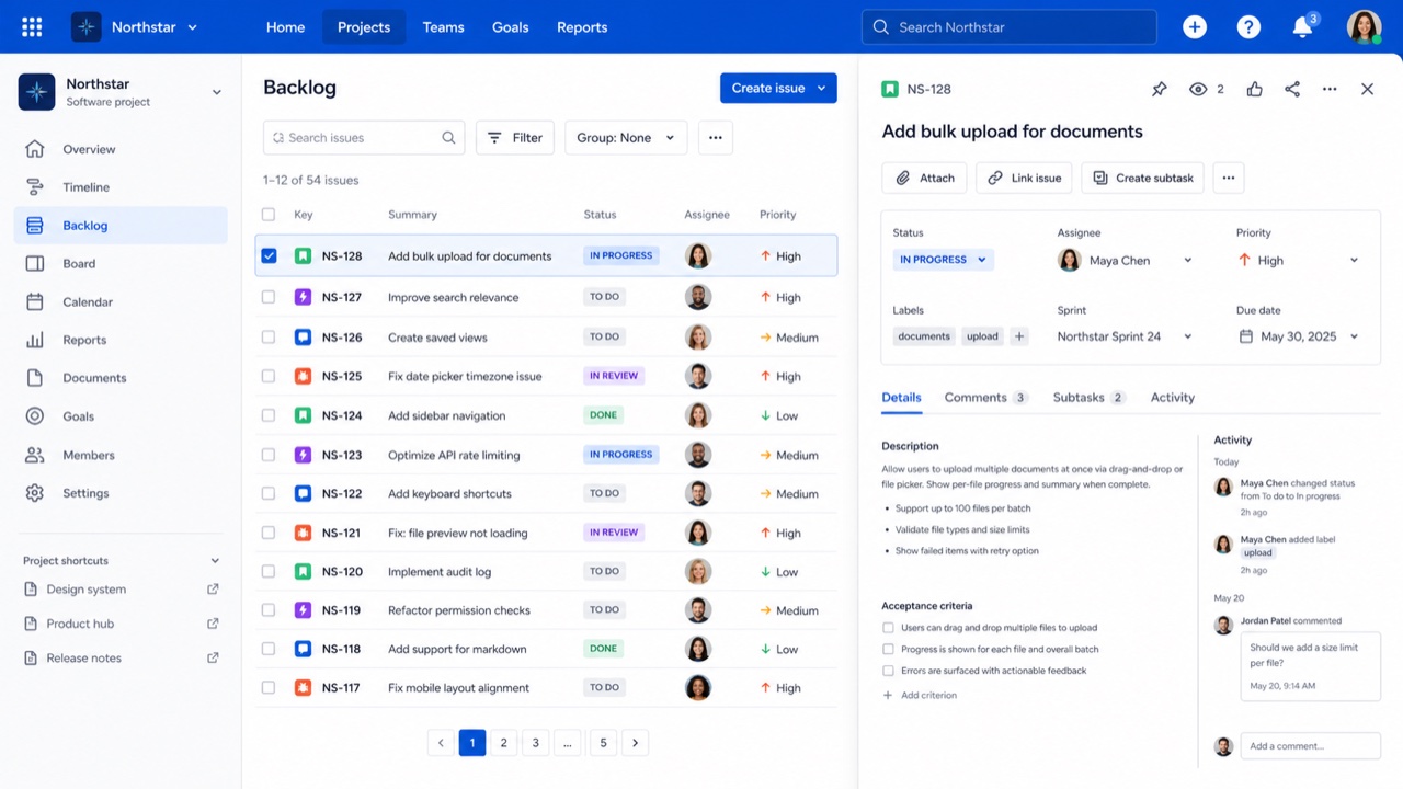
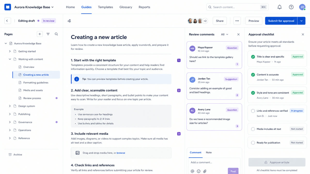
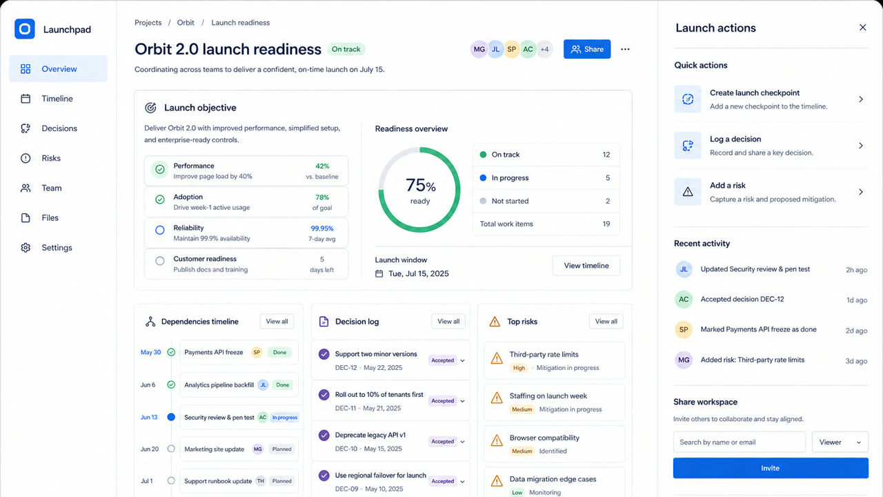
Un système qui traduit la complexité de Jira et Confluence en jetons, règles éditoriales, espacements, grilles et composants partagés. La cohérence inspire confiance tout en gardant navigables de grands ensembles de tickets, de documents et d'états.
En un coup d’œil
Signes visuels
- Des couches blanches et gris pâle avec des actions principales bleues
- Des cartes arrondies et des libellés d'état en forme de pastille
- Des divisions nettes entre barre latérale, tableau et panneau de détail
- Couleur, espacement, rayon et élévation pilotés par des jetons
Usages idéaux
- Work-management products where people move repeatedly between lists and details
- Keeping a trusted family resemblance across products without hiding their complexity
Utiliser ce style
Appliquez le brief concis au projet ou transmettez la spécification structurée à un outil d’IA.
Guide détaillé et sourcesRègles de production, œuvres de référence, comparaisons, recherche et citations
Entrée du dictionnaire
- Typographie
- Fix the steps for headings, body and labels; keep status names short inside lozenges.
- Composition
- Keep navigation, list and detail roles stable; use token multiples for spacing.
- Matière
- Use white and pale gray as the base, blue for primary actions and one semantic meaning per status color.
- Précaution
- Too many cards and status labels give every component equal force and hide the work that matters next.
- Pour approfondir
- Atlassian design principles / Status lozenges / Spacing, radius and elevation tokens
Entrées liées
- GitHub Primer (GitHub Primer)Même famille : Langages d'écran.Comparer Atlassian Design System et GitHub Primer
- Corporate Memphis (コーポレート・メンフィス)Effets partagés : Intimacy / Trust.Comparer Atlassian Design System et Corporate Memphis
Plus de Langages d'écran
Poursuivez avec des styles de Langages d'écran, classés par effets communs.
- Shopify Polaris (Shopify Polaris)Effets partagés : Trust / Intimacy / Technique.
- Salesforce Lightning Design System (Salesforce Lightning)Effets partagés : Trust / Technique / Intimacy.
- Ubuntu Yaru (Ubuntu Yaru)Effets partagés : Technique / Intimacy / Trust.
Voir toutes les entrées Langages d'écran
Citer cette entrée
Le dictionnaire est fait pour être lié. Prenez la forme qui convient là où vous écrivez.
- Link
- https://indexstyle.org/fr/styles/atlassian-design-system
- Markdown
- [Atlassian Design System — IndexStyle](https://indexstyle.org/fr/styles/atlassian-design-system)
- HTML
- <a href="https://indexstyle.org/fr/styles/atlassian-design-system">Atlassian Design System — IndexStyle</a>