Atlassian Design System
Atlassian Design System / 2012– / Estilo / Lenguajes de pantalla
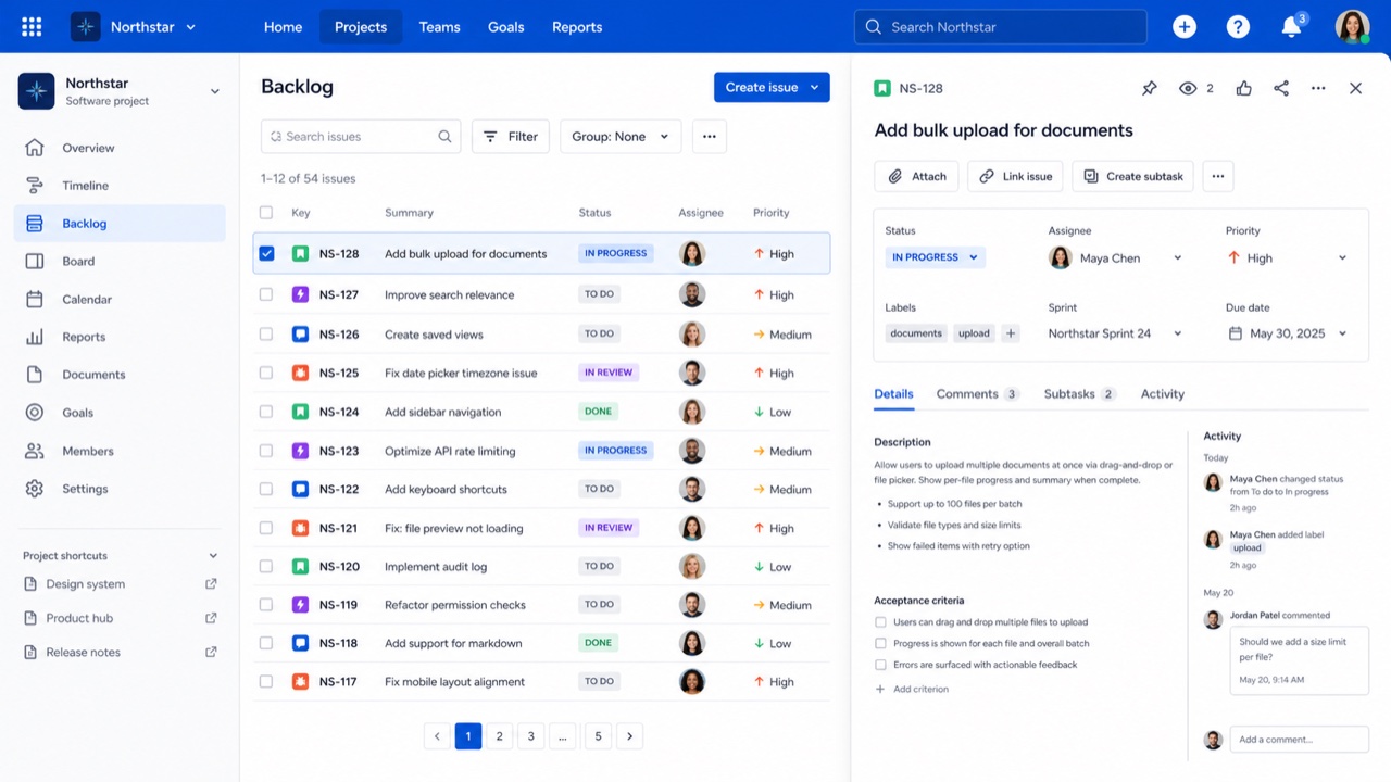
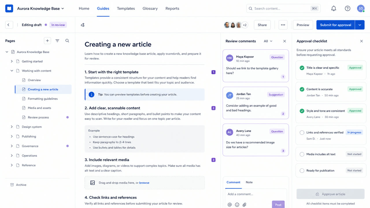
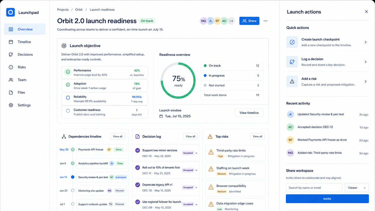
Un sistema que traduce la complejidad de Jira y Confluence a tokens, reglas de contenido, espaciado, retículas y componentes compartidos. La consistencia genera confianza y mantiene navegables grandes conjuntos de incidencias, documentos y estados.
De un vistazo
Rasgos visuales
- Capas blancas y gris pálido con acciones principales azules
- Tarjetas redondeadas y etiquetas de estado en forma de cápsula
- Divisiones claras entre barra lateral, tabla y panel de detalle
- Color, espaciado, radio y elevación gobernados por tokens
Usos idóneos
- Work-management products where people move repeatedly between lists and details
- Keeping a trusted family resemblance across products without hiding their complexity
Usar este estilo
Lleva el resumen al proyecto o entrega la especificación estructurada a una herramienta de IA.
Guía detallada y fuentesReglas de producción, obras de referencia, comparaciones, investigación y citas
Entrada del diccionario
- Tipografía
- Fix the steps for headings, body and labels; keep status names short inside lozenges.
- Composición
- Keep navigation, list and detail roles stable; use token multiples for spacing.
- Material
- Use white and pale gray as the base, blue for primary actions and one semantic meaning per status color.
- Precaución
- Too many cards and status labels give every component equal force and hide the work that matters next.
- Para profundizar
- Atlassian design principles / Status lozenges / Spacing, radius and elevation tokens
Entradas relacionadas
- GitHub Primer (GitHub Primer)Misma familia: Lenguajes de pantalla.Comparar Atlassian Design System y GitHub Primer
- Corporate Memphis (コーポレート・メンフィス)Efectos compartidos: Intimacy / Trust.Comparar Atlassian Design System y Corporate Memphis
Más de Lenguajes de pantalla
Continúa con estilos de Lenguajes de pantalla, priorizados por sus efectos compartidos.
- Shopify Polaris (Shopify Polaris)Efectos compartidos: Trust / Intimacy / Technique.
- Salesforce Lightning Design System (Salesforce Lightning)Efectos compartidos: Trust / Technique / Intimacy.
- Ubuntu Yaru (Ubuntu Yaru)Efectos compartidos: Technique / Intimacy / Trust.
Ver todas las entradas de Lenguajes de pantalla
Citar esta entrada
El diccionario existe para que se enlace. Toma la forma que encaje donde estés escribiendo.
- Link
- https://indexstyle.org/es/styles/atlassian-design-system
- Markdown
- [Atlassian Design System — IndexStyle](https://indexstyle.org/es/styles/atlassian-design-system)
- HTML
- <a href="https://indexstyle.org/es/styles/atlassian-design-system">Atlassian Design System — IndexStyle</a>