Atlassian Design System
Atlassian Design System / 2012– / 양식 / 플랫폼 화면 언어
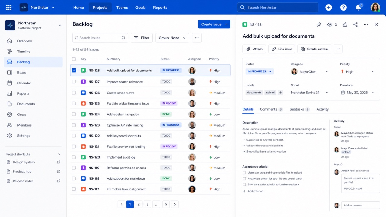
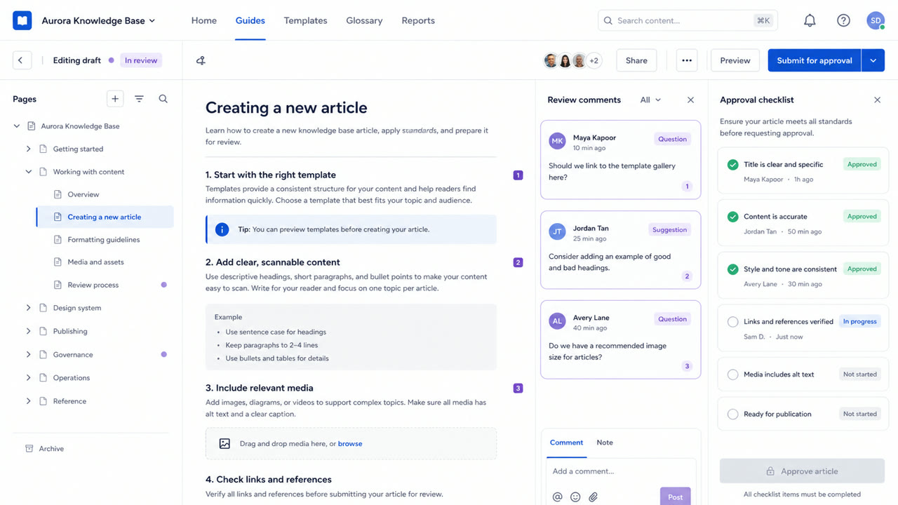
Jira와 Confluence의 복잡함을 공통 토큰, 콘텐츠 규칙, 간격, 그리드, 컴포넌트로 옮기는 시스템이다. 일관성이 신뢰를 만들고 많은 이슈, 문서, 상태를 계속 탐색할 수 있게 한다.

한눈에 판단
시각적 특징
- 흰색과 옅은 회색 층, 파란색 주요 행동
- 둥근 카드와 캡슐 모양 상태 이름표
- 사이드바, 표, 상세 패널 사이의 뚜렷한 구분
- 토큰이 색, 간격, 모서리와 높이를 통제한다
적합한 용도
- Work-management products where people move repeatedly between lists and details
- Keeping a trusted family resemblance across products without hiding their complexity
이 양식 사용하기
짧은 지침을 프로젝트에 적용하거나 구조화된 사양을 AI 도구에 넘길 수 있습니다.
자세한 제작법과 출처제작 규칙, 실제 사례, 비교, 연구, 인용 형식
사전 항목
- 타이포그래피
- Fix the steps for headings, body and labels; keep status names short inside lozenges.
- 구성
- Keep navigation, list and detail roles stable; use token multiples for spacing.
- 재료
- Use white and pale gray as the base, blue for primary actions and one semantic meaning per status color.
- 주의
- Too many cards and status labels give every component equal force and hide the work that matters next.
- 더 읽을거리
- Atlassian design principles / Status lozenges / Spacing, radius and elevation tokens
관련 항목
- GitHub Primer (GitHub Primer)같은 계열: 플랫폼 화면 언어.Atlassian Design System와 GitHub Primer 비교
- Corporate Memphis (コーポレート・メンフィス)공통 인상: Intimacy / Trust.Atlassian Design System와 Corporate Memphis 비교
플랫폼 화면 언어 더 보기
플랫폼 화면 언어에서 공통 인상이 많은 항목을 우선해 골랐습니다.
- Shopify Polaris (Shopify Polaris)공통 인상: Trust / Intimacy / Technique.
- Salesforce Lightning Design System (Salesforce Lightning)공통 인상: Trust / Technique / Intimacy.
- Ubuntu Yaru (Ubuntu Yaru)공통 인상: Technique / Intimacy / Trust.
이 항목을 인용하기
사전은 링크되기 위해 있다. 글을 쓰는 자리에 맞는 형식을 그대로 가져가면 된다.
- Link
- https://indexstyle.org/ko/styles/atlassian-design-system
- Markdown
- [Atlassian Design System — IndexStyle](https://indexstyle.org/ko/styles/atlassian-design-system)
- HTML
- <a href="https://indexstyle.org/ko/styles/atlassian-design-system">Atlassian Design System — IndexStyle</a>