Grunge vs Sportsbrut
グランジ / スポーツブルート
Grunge comes from Counterculture and Sportsbrut from Contemporary Branding. They are reached for with some of the same intent, which is where they get confused.
Grunge
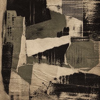
Uses dirt, tears and wear as resistance to the neatly managed screen.
Sportsbrut
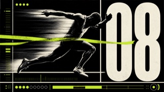
A sports-graphic style connecting brutalist grids, huge type, and exposed structure with competition, timing, bodies, and scores. Roughness communicates force and urgency rather than institutional refusal.
| Grunge | Sportsbrut | |
|---|---|---|
| Era | 1990s | late 2010s– |
| Family | Counterculture | Contemporary Branding |
| Kind | Style | Style |
| Cues | Scuffing / Tears / Disordered type / Low-quality copies | Huge condensed type and jersey numbers cutting across the frame / Coarse halftones, cut-out athletes, and directional blur / Black and white plus one fluorescent or team color / Exposed scores, times, and rankings in heavy ruled grids |
| Best used for | Body heat for music and street culture · Deliberately breaking the look of a finished product | Match promotion, player profiles, and results systems that need immediate force and speed · Sports branding that favors bodies and competition over polished luxury |
| Type | Decayed sans, typewriter faces | Expand ultra-bold condensed type to frame width and elevate numbers to the headline level. |
| Composition | Overlap and crop; keep alignment only in places | Lock photos, records, and names to a heavy orthogonal grid; introduce blur or diagonals in only one direction. |
| Material | Dirty paper, grain, low chroma plus one accent | Move between print and screen using coarse halftones, hard cutouts, monochrome, and one fluorescent or team color. |
| Caution | Texture overlays alone feel dated. Run the logic of wear through photo, type and margin alike. | Bold black type alone becomes web Neubrutalism. Athletes, competitive data, and time pressure must drive the composition itself. |