Kinetic Typography
キネティック・タイポグラフィ / 1950s– / 기법 / 타이포그래피
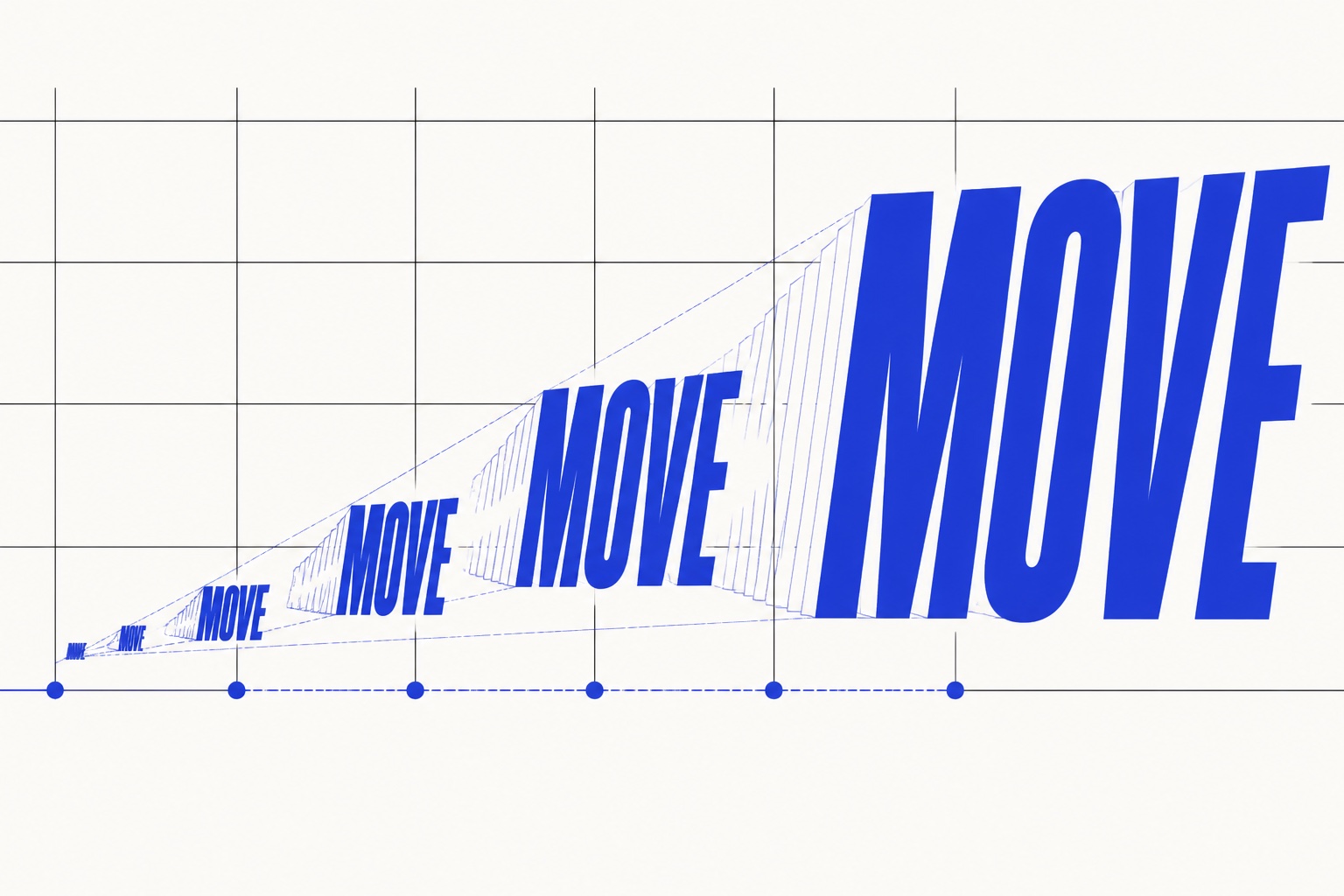
Kinetic typography는 시간선에 따라 위치, 속도, 척도, 형태 및 타이밍의 변화를 사용하여 음성 강조, 감정 및 주의를 구축합니다. 글자는 레이어가 아닙니다. 움직임은 의미를 전달합니다.
%20-%20Opening%20Crawl.jpg)
한눈에 판단
시각적 특징
- 음성 강조에 따른 속도와 크기 변화
- 단어나 문자에 의해 엇갈린 엔트리와 종료
- 단어의 의미에 맞는 여행, 회전 또는 변형
- 홀드 및 읽기 순서를 기반으로 구축된 시간적 계층 구조
적합한 용도
- Joining tone of voice and moving type in titles, advertising and lyric films
- Adding emotion and emphasis to short explanations or conversations without sound
이 양식 사용하기
짧은 지침을 프로젝트에 적용하거나 구조화된 사양을 AI 도구에 넘길 수 있습니다.
자세한 제작법과 출처제작 규칙, 실제 사례, 비교, 연구, 인용 형식
사전 항목
- 타이포그래피
- Break copy into words and syllables, mapping speed, holds and scale changes to what each unit says.
- 구성
- Limit how much is read at once and use the next word's position to preview eye direction.
- 재료
- Move only the necessary axes among position, rotation, scale, tracking, weight and opacity, testing legibility at rest.
- 주의
- When every letter always bounces, motion becomes noise. Keep passages still whenever removing motion would not change meaning.
- 더 읽을거리
- CMU Kinetic Typography research / Temporal change and expressive text / Reading time, attention and emotion
관련 항목
- Saul Bass Title Design (ソール・バスのタイトルデザイン)공통 인상: Exhilaration / Play.Kinetic Typography와 Saul Bass Title Design 비교
- Concrete Poetry (具体詩/コンクリート・ポエトリー)공통 인상: Play.Kinetic Typography와 Concrete Poetry 비교
이 항목을 인용하기
사전은 링크되기 위해 있다. 글을 쓰는 자리에 맞는 형식을 그대로 가져가면 된다.
- Link
- https://indexstyle.org/ko/styles/kinetic-typography
- Markdown
- [Kinetic Typography — IndexStyle](https://indexstyle.org/ko/styles/kinetic-typography)
- HTML
- <a href="https://indexstyle.org/ko/styles/kinetic-typography">Kinetic Typography — IndexStyle</a>