New Wave vs The Face
ニュー・ウェーブ / ザ・フェイス
New Wave comes from Counterculture and The Face from Publishing and Editing. They are reached for with different intent, which is the fastest way to tell them apart.
New Wave


Keeps punk's freedom while re-editing color and grid with urban polish.
The Face
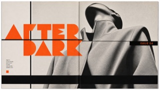
Redraws its headline letters and section marks issue by issue, then sets them into a page of heavy rules and black bars with the same weight as the photographs.
| New Wave | The Face | |
|---|---|---|
| Era | 1970s–1980s | 1980s |
| Family | Counterculture | Publishing and Editing |
| Kind | Style | Style |
| Cues | Irregular grid / Dots / High chroma / Rotated type | Extra bold headline letters drawn on geometry / Heavy rules and black bars dividing the page / Section marks that change shape issue by issue / Large type laid over the photograph |
| Best used for | Editorial heat for culture media · Adding surprise to serious content | Music and fashion magazines where the type is meant to carry as much of the page as the photographs · Publishing where the headline letters are redrawn issue by issue and the change is shown to the reader |
| Type | Mix condensed, geometric and vertical setting | Draw the headline weight from geometry as extra bold, and hold the text in a small sans |
| Composition | Shift the grid; hold several angles at once | Divide the page with heavy rules and black bars, and lay large type over the photograph |
| Material | Yellow, red, blue, dots, thin rules | Keep a set of section marks that change shape each issue, working in black areas and reversed white |
| Caution | Don't multiply small decorations. Choose one starring deviation. | When redrawing the letterforms every issue becomes the aim in itself, the marks stop working as signposts for the reader and every issue looks equally loud. |