Minimalism vs The Face
ミニマリズム / ザ・フェイス
Minimalism comes from Functionalism and The Face from Publishing and Editing. They are reached for with some of the same intent, which is where they get confused.
Minimalism
%201%E2%80%935%20(1987)%2C%20Tate%20Modern%2C%20London%2C%20UK.jpg)
Removes elements to maximize the meaning and tension of what remains.
The Face
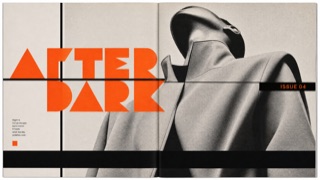
Redraws its headline letters and section marks issue by issue, then sets them into a page of heavy rules and black bars with the same weight as the photographs.
| Minimalism | The Face | |
|---|---|---|
| Era | 1960s– | 1980s |
| Family | Functionalism | Publishing and Editing |
| Kind | Style | Style |
| Cues | Vast white space / Few elements / Quiet color / Precise spacing | Extra bold headline letters drawn on geometry / Heavy rules and black bars dividing the page / Section marks that change shape issue by issue / Large type laid over the photograph |
| Best used for | Focusing attention on a single value · Letting quality speak quietly | Music and fashion magazines where the type is meant to carry as much of the page as the photographs · Publishing where the headline letters are redrawn issue by issue and the change is shown to the reader |
| Type | A light sans-serif or a well-cut serif | Draw the headline weight from geometry as extra bold, and hold the text in a small sans |
| Composition | One message, one focal point, wide margins | Divide the page with heavy rules and black bars, and lay large type over the photograph |
| Material | Nearly achromatic; texture in exactly one place | Keep a set of section marks that change shape each issue, working in black areas and reversed white |
| Caution | Missing information is not minimal. Decide priorities before you cut. | When redrawing the letterforms every issue becomes the aim in itself, the marks stop working as signposts for the reader and every issue looks equally loud. |