Swiss vs Talnemokkol (De-squared Hangul)
スイス・スタイル / 脱ネモ体
Swiss comes from Functionalism and Talnemokkol (De-squared Hangul) from Type Classification. They are reached for with some of the same intent, which is where they get confused.
Swiss


Puts order front and center and makes the information itself the protagonist.
Talnemokkol (De-squared Hangul)
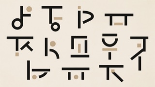
Hangul type that gives up fitting each syllable into a square and stacks consonant and vowel as fixed shapes, so height and width change from letter to letter. Ahn Sang-soo's typeface and posters carried the form to a wide audience.
| Swiss | Talnemokkol (De-squared Hangul) | |
|---|---|---|
| Era | 1950s– | 1980s- |
| Family | Functionalism | Type Classification |
| Kind | Style | Style |
| Cues | Strict grid / Sans-serif type / Asymmetry / Objective photography | Letter outlines breaking out of the square / Height and width changing letter by letter / Strokes of even weight, geometric in build / Lines whose feet do not align |
| Best used for | Making complex information fast to read · Giving an organization rationality and transparency | Headlines and titling where the assembly of Hangul itself is meant to show · Pages that step away from the default square setting to find another rhythm |
| Type | Neutral sans-serif; be bold with size contrast | Fix the shapes of consonant and vowel and leave the height and width changing from letter to letter |
| Composition | 12-column grid, left-aligned, asymmetric | Open the leading to absorb the uneven feet of the lines, and keep the measure short |
| Material | White space and objective photographs; almost no ornament | Assume large sizes, hold the stroke to one weight, and let the ragged outline show |
| Caution | Too much tidiness turns anonymous. Keep one strong jump in scale. | At text size and over long passages, the uneven feet of the lines make them waver and reading slows. Keep it to headlines and other places where it is set large. |