Aqua vs Liquid Glass
アクア / リキッドガラス
Both sit in Apple UI, so the question is not what they belong to but how they behave. They are reached for with some of the same intent, which is where they get confused.
Aqua


Mac OS X's design language of buttons you want to lick. Jelly gloss, pinstripes, deep shadows and the genie effect staged digital components as objects you could touch, and set the terms for UI throughout the 2000s. What the web made of it with images is Web 2.0 Gloss.
Liquid Glass
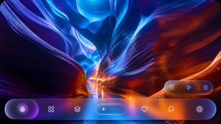
Unifies the floating control and navigation layer as a fluid glass material that refracts and adapts to the content beneath.
| Aqua | Liquid Glass | |
|---|---|---|
| Era | 2000–2014 | 2025– |
| Family | Apple UI | Apple UI |
| Kind | Style | Style |
| Cues | Gel-gloss buttons / Pinstriped grounds / Deep drop shadows / Metaphors of water and light | Dynamic refraction / Concentric corner radii / Floating control layers / Reflected background color |
| Best used for | Recreating 2000s digital culture with the texture it actually had · Making what is clickable read at once as a pressable object | Apps that show content full bleed while floating only the controls above it. · Screens where light, dark and wallpaper change but control positions must hold. |
| Type | No shadow on text, weighted to stay legible over gloss | Keep text off the material itself and set minimum sizes from measured contrast. |
| Composition | Components evenly spaced, gaps left for shadows to fall into | Hold controls to the edges and make inner and outer radii concentric. |
| Material | A hard white highlight above, reflection and deep shadow below | Use one refracting layer only, letting it pick up the color beneath. |
| Caution | Gloss and shadow applied evenly to every component hides what is actually pressable, leaving texture where hierarchy should be. | Keep it to the control layer rather than decorating content with translucent cards. Each added layer lets more background through until text fails, so check legibility on devices and honor Reduce Transparency. |