Kinetic Typography vs Title Sequence
キネティック・タイポグラフィ / タイトルシーケンス
Kinetic Typography comes from Lettering and Title Sequence from Broadcast Design. One is technique and the other style. They are reached for with some of the same intent, which is where they get confused.
Kinetic Typography
%20-%20Opening%20Crawl.jpg)
Converts the meaning of a word into speed, pause and direction, so that the time of reading is itself designed.
Title Sequence
%20movie%20logo.png)


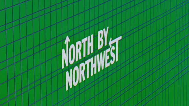
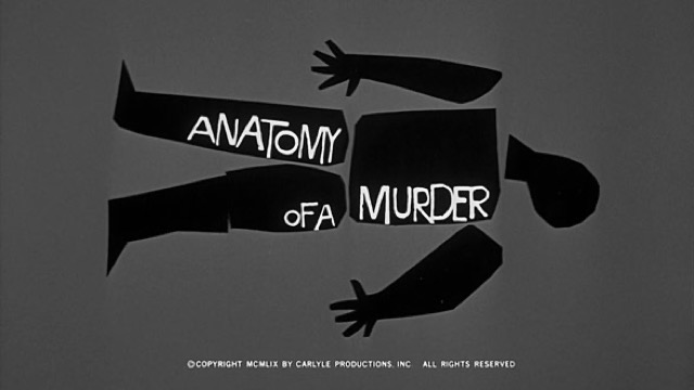
A film's opening minutes designed as a work in their own right, with shape, type and music synchronized to state the theme before the story does. Saul Bass redefined the title as a prologue rather than a preview.
| Kinetic Typography | Title Sequence | |
|---|---|---|
| Era | film titles–digital motion | 1955– |
| Family | Lettering | Broadcast Design |
| Kind | Technique | Style |
| Cues | Per-word motion / Rhythm / Scale change / Pauses | Cut-paper shapes / Type synced to music / The theme compressed / Art independent of the feature |
| Best used for | Making a short message physically felt · Carrying the intonation of voice and music to the screen | Handing over a work's theme and temperature before the story starts · Redesigning the obligation of credits as a piece in its own right |
| Type | One family, varied in weight and width | One face only, entrances and exits designed to the musical beat |
| Composition | Split the sentence into words; assign each a trajectory that fits its meaning | Hand the names to the moving shapes, fix one reading position |
| Material | Keep the ground quiet; the timing offsets are the star | Art built apart from the feature, few colors, one repeated motif |
| Caution | Don't move every word. Motion reads because some words stand still. | Decoration unrelated to the feature is not the form, since only the structure that summarizes the theme survives, and when moving the names becomes the point there is no time to read them. |