Kinetic Typography vs Swiss
キネティック・タイポグラフィ / スイス・スタイル
Kinetic Typography comes from Lettering and Swiss from Functionalism. One is technique and the other style. They are reached for with different intent, which is the fastest way to tell them apart.
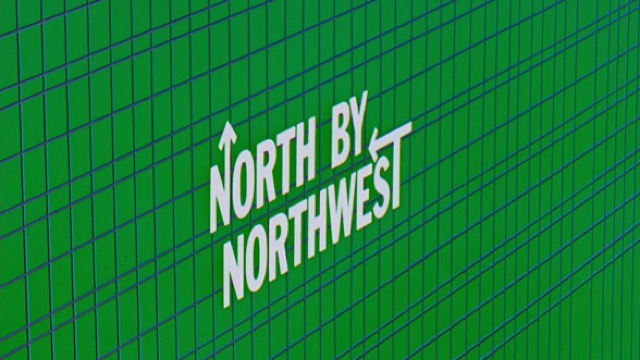
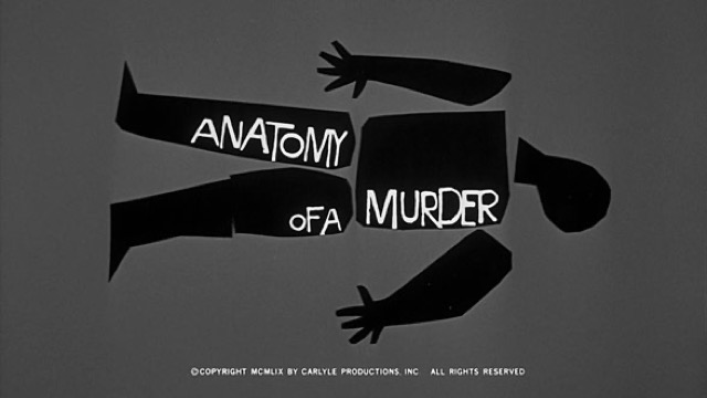
Kinetic Typography
%20-%20Opening%20Crawl.jpg)
Converts the meaning of a word into speed, pause and direction, so that the time of reading is itself designed.
Swiss
.jpg)


Puts order front and center and makes the information itself the protagonist.
| Kinetic Typography | Swiss | |
|---|---|---|
| Era | film titles–digital motion | 1950s– |
| Family | Lettering | Functionalism |
| Kind | Technique | Style |
| Cues | Per-word motion / Rhythm / Scale change / Pauses | Strict grid / Sans-serif type / Asymmetry / Objective photography |
| Best used for | Making a short message physically felt · Carrying the intonation of voice and music to the screen | Making complex information fast to read · Giving an organization rationality and transparency |
| Type | One family, varied in weight and width | Neutral sans-serif; be bold with size contrast |
| Composition | Split the sentence into words; assign each a trajectory that fits its meaning | 12-column grid, left-aligned, asymmetric |
| Material | Keep the ground quiet; the timing offsets are the star | White space and objective photographs; almost no ornament |
| Caution | Don't move every word. Motion reads because some words stand still. | Too much tidiness turns anonymous. Keep one strong jump in scale. |