Kinetic Typography vs Silent Film Intertitle
キネティック・タイポグラフィ / サイレント映画の字幕カード
Kinetic Typography comes from Lettering and Silent Film Intertitle from Film Technology. Both are read here as technique. They are reached for with some of the same intent, which is where they get confused.
Kinetic Typography
%20-%20Opening%20Crawl.jpg)
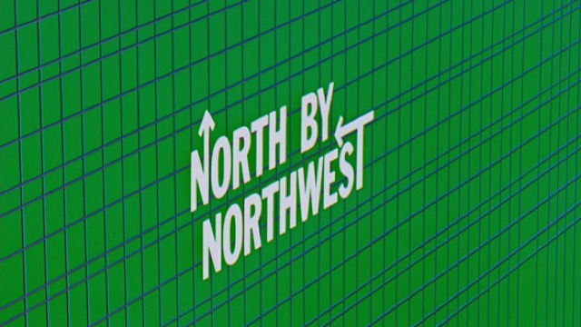
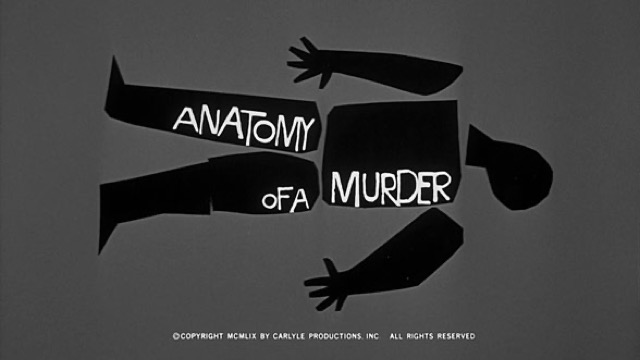
Converts the meaning of a word into speed, pause and direction, so that the time of reading is itself designed.
Silent Film Intertitle


.jpg)
Dialogue and description were cut into the film as separate cards of type. This is where cinema and typography first met.
| Kinetic Typography | Silent Film Intertitle | |
|---|---|---|
| Era | film titles–digital motion | 1900s–1920s |
| Family | Lettering | Film Technology |
| Kind | Technique | Technique |
| Cues | Per-word motion / Rhythm / Scale change / Pauses | Text cards on black / Ornamental frames / Hand lettering / Alternating rhythm with the action |
| Best used for | Making a short message physically felt · Carrying the intonation of voice and music to the screen | Short films watched without sound that need dialogue on separate cards · Chapter breaks and advertising borrowing the manner of the silent era |
| Type | One family, varied in weight and width | Different faces for speech and narration, trimmed to fit one card |
| Composition | Split the sentence into words; assign each a trajectory that fits its meaning | Center the text and keep even space on all four sides |
| Material | Keep the ground quiet; the timing offsets are the star | White out of black, with a faint film weave and gate flicker |
| Caution | Don't move every word. Motion reads because some words stand still. | Cards that explain too much stop the flow every time they appear, and the film turns into something to be read rather than watched. |