Memphis vs Wacky Pomo
メンフィス / ワッキー・ポモ
Memphis comes from Pop and Wacky Pomo from Illustration Styles. They are reached for with some of the same intent, which is where they get confused.
Memphis


.jpg)
Laughs off functionalism and enjoys the dissonance of shape and color.
Wacky Pomo
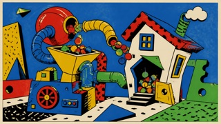
A postmodern children’s-marketing style mixing Googie, Memphis, old cartoons, factory signs, and odd Victorian figures into exaggeration and mild bad taste. It cartoonizes everything until product and place resemble a giant invention machine.
| Memphis | Wacky Pomo | |
|---|---|---|
| Era | 1980s | early 1990s–early 2000s |
| Family | Pop | Illustration Styles |
| Kind | Style | Style |
| Cues | Zigzags / Small figures / Pastel plus primary / Speckles | Distorted checks, spirals, zigzags, and bursting arrows / Cartoon gears, pipes, eyes, tongues, and strange machines / Violet, lime, orange, and red with black outlines / Heavy headlines whose letters change shape and angle |
| Best used for | Softening a stiff subject · A young, sunny personality | Making toys, sweets, games, or attractions behave like one giant cartoon machine · Studying 1990s children’s advertising through both visual language and promotion ethics |
| Type | A chunky geometric sans | Tilt heavy display letters individually and use no more than two layers of shadow, outline, or dots. |
| Composition | Scatter small motifs, anchor with one large shape | Extend spirals and pipes from the central product and stage one small event in each corner. |
| Material | Pink, yellow, teal, black speckles | Unify flat spot color, rough cartoon lines, molded plastic, and painted metal at high saturation. |
| Caution | Don't stop at background pattern. Map the figures to navigation and units of meaning. | Do not use density merely to seize children’s attention. Keep age, advertising disclosure, and safety information above decoration in the hierarchy. |