Stippling
スティップリング(点描陰影) / 16th century– / 기법 / Hand-drawn
스틸링은 작은 점의 밀도와 크기를 통해 빛, 부피 및 표면을 만듭니다. 선으로 윤곽을 채우지 않고 희소에서부터 빽빽하게 변화하는 음영을 생성합니다.

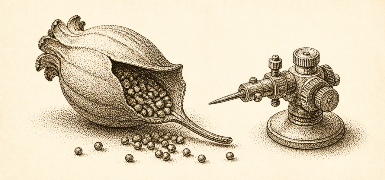
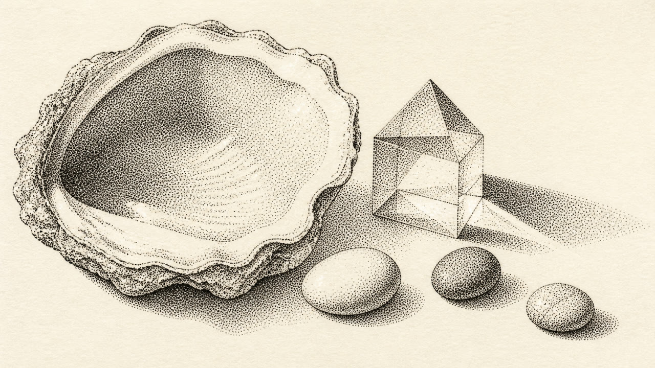
한눈에 판단
시각적 특징
- 윤곽을 채우는 수없이 많은 작은 점
- 어두운 영역에서의 좁은 간격
- 선이 없는 부드러운 음영
- 가까운 곳에서 미세한 곡물과 멀리서 매끄러운 부피
적합한 용도
- Scientific illustration, natural history and portraiture with delicate volume
- Giving packaging and posters quiet hand-built grain
이 양식 사용하기
짧은 지침을 프로젝트에 적용하거나 구조화된 사양을 AI 도구에 넘길 수 있습니다.
자세한 제작법과 출처제작 규칙, 실제 사례, 비교, 연구, 인용 형식
사전 항목
- 타이포그래피
- Use a fine serif or small capitals with enough air from dotted fields.
- 구성
- Begin at the darkest point and build the subject by density rather than outline.
- 재료
- Keep one nib size and vary spacing more than dot size to construct tone.
- 주의
- Random noise and halftone are different. Each dot's density must explain form and light.
- 더 읽을거리
- Pen-and-ink stippling / Dot density and value / Stipple engraving
관련 항목
- Mezzotint (メゾチント)공통 인상: Luxury / Calm.Stippling와 Mezzotint 비교
- Halftone (ハーフトーン(網点))공통 인상: Technique.Stippling와 Halftone 비교
Hand-drawn 더 보기
Hand-drawn에서 공통 인상이 많은 항목을 우선해 골랐습니다.
- Scratchboard (スクラッチボード)공통 인상: Luxury / Technique.
이 항목을 인용하기
사전은 링크되기 위해 있다. 글을 쓰는 자리에 맞는 형식을 그대로 가져가면 된다.
- Link
- https://indexstyle.org/ko/styles/stippling
- Markdown
- [Stippling — IndexStyle](https://indexstyle.org/ko/styles/stippling)
- HTML
- <a href="https://indexstyle.org/ko/styles/stippling">Stippling — IndexStyle</a>