Firefox Proton
Firefox Proton / 2021–2026 / 양식 / 플랫폼 화면 언어
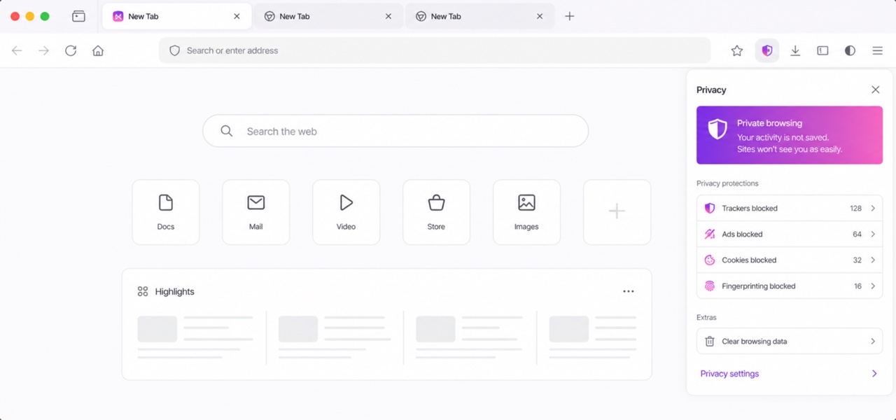
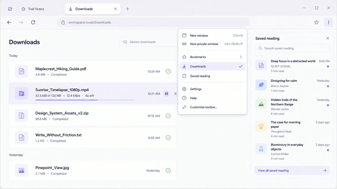
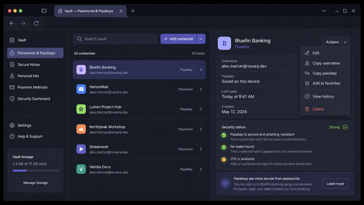
파이어폭스 89의 재설계는 데스크톱, iOS 및 안드로이드에서 도구 모음과 메뉴를 간소화하고, 부드러운 둥근 탭을 도입하며, 밝은 아이콘과 더 넓은 공간, 그리고 보라색 색상을 사용하여 브라우저를 더욱 밝고 차분하게 만들었습니다.
한눈에 판단
시각적 특징
- 도구 모음 위에 떠 있는 활성 탭
- 최소한의 중복된 아이콘을 가진 텍스트 기반 메뉴
- 넉넉한 공간과 밝은 선형 아이콘
- 보라색 및 파란색 선택 상태를 갖춘 중립적인 브라우저 크롬
적합한 용도
- Unifying browser toolbars, tabs, menus and alerts into a calm language that recedes behind content
- Aligning the words and icons of core actions across desktop, iOS and Android
이 양식 사용하기
짧은 지침을 프로젝트에 적용하거나 구조화된 사양을 AI 도구에 넘길 수 있습니다.
자세한 제작법과 출처제작 규칙, 실제 사례, 비교, 연구, 인용 형식
사전 항목
- 타이포그래피
- Reduce labels to short verbs and nouns; remove redundant icons so wording carries the hierarchy.
- 구성
- Keep the toolbar light, float only the active tab as a rounded independent surface and order menu actions by priority in one column.
- 재료
- Build on neutral light surfaces and open spacing; reserve purple and blue for focus and selection and shadows for the floating tab.
- 주의
- More rounding and whitespace alone only lowers information density. Make every removed icon legible through wording and order.
- 더 읽을거리
- Firefox 89 redesign / Floating tab model / Cross-platform iconography and menu simplification
관련 항목
- Firefox Photon (Firefox Photon)같은 계열: 플랫폼 화면 언어.Firefox Proton와 Firefox Photon 비교
- Material You (Material You)공통 인상: Intimacy / Technique.Firefox Proton와 Material You 비교
플랫폼 화면 언어 더 보기
플랫폼 화면 언어에서 공통 인상이 많은 항목을 우선해 골랐습니다.
- elementary OS (elementary OS)공통 인상: Intimacy / Calm / Technique.
- NeXTSTEP Interface (ネクストステップ・インターフェース)공통 인상: Technique / Calm.
- Adwaita (アドワイタ)공통 인상: Technique / Calm.
이 항목을 인용하기
사전은 링크되기 위해 있다. 글을 쓰는 자리에 맞는 형식을 그대로 가져가면 된다.
- Link
- https://indexstyle.org/ko/styles/firefox-proton
- Markdown
- [Firefox Proton — IndexStyle](https://indexstyle.org/ko/styles/firefox-proton)
- HTML
- <a href="https://indexstyle.org/ko/styles/firefox-proton">Firefox Proton — IndexStyle</a>