Firefox Proton vs Material You
Firefox Proton / Material You
Firefox Proton comes from Platform Screen Languages and Material You from Google UI. They are reached for with some of the same intent, which is where they get confused.
Firefox Proton
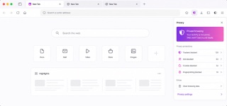
The Firefox 89 redesign made the browser brighter and calmer by streamlining toolbars and menus and adopting floating rounded tabs, lighter iconography, more spacing and a purple-inflected palette across desktop, iOS and Android.
Material You

.jpg)
Material You makes adaptability itself consistent: dynamic color, generous shapes and personalized motion vary by person while semantic roles stay stable.
| Firefox Proton | Material You | |
|---|---|---|
| Era | 2021–2026 | 2021– |
| Family | Platform Screen Languages | Google UI |
| Kind | Style | Style |
| Cues | A rounded active tab floating above the toolbar / Text-led menus with fewer redundant icons / Generous spacing and light linear iconography / Neutral browser chrome with purple and blue selection states | Harmonized colors derived from wallpaper / Large rounded cards and controls / Selection changes both color and shape / Broad spacing and large display type |
| Best used for | Unifying browser toolbars, tabs, menus and alerts into a calm language that recedes behind content · Aligning the words and icons of core actions across desktop, iOS and Android | Safely reflecting a user's palette in a product · Letting one component system support varied personal appearances |
| Type | Reduce labels to short verbs and nouns; remove redundant icons so wording carries the hierarchy. | Keep hierarchy in weight and scale so it survives changes of color. |
| Composition | Keep the toolbar light, float only the active tab as a rounded independent surface and order menu actions by priority in one column. | Set large rounded surfaces in generous space and express selection through shape, color and motion together. |
| Material | Build on neutral light surfaces and open spacing; reserve purple and blue for focus and selection and shadows for the floating tab. | Generate tonal palettes from a seed, then assign them to semantic surface and content roles. |
| Caution | More rounding and whitespace alone only lowers information density. Make every removed icon legible through wording and order. | Automatic color generation alone can produce unreadable interfaces. Contrast and semantic roles come first. |