Luxury Minimal vs Neubrutalism
ラグジュアリー・ミニマル / ニューブルータリズム
Luxury Minimal comes from Contemporary Branding and Neubrutalism from UI Expression. Both are read here as style. They are reached for with different intent, which is the fastest way to tell them apart.
Luxury Minimal
.jpg)
.jpg)

Communicates confidence, not price, through silent margins and precise typesetting.
Neubrutalism
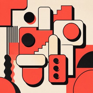
Rebels warmly against the over-polished web with thick borders and blunt color.
| Luxury Minimal | Neubrutalism | |
|---|---|---|
| Era | 1990s– | 2010s– |
| Family | Contemporary Branding | UI Expression |
| Kind | Style | Style |
| Cues | Vast margins / Refined serifs / Low chroma / Quiet photography | Thick black borders / Hard shadows / Vivid color / Flat components |
| Best used for | Conveying quality without raising your voice · Making the product or photo the single focus | Making a product frank and memorable · Humanity for communities and creator tools |
| Type | High-contrast serif with a small sans | Bold sans, monospace |
| Composition | One point at the center or edge; margins play the lead | Divide into clear boxes; shadows in one direction |
| Material | Off-white, black, faint textures of stone and cloth | Off-white plus vivid color, black borders, few rounded corners |
| Caution | Tiny type and faint color are not luxury. Being readable comes first. | Don't border and shadow everything. Vary the strength by hierarchy. |