Luxury Minimal vs Metalheart
ラグジュアリー・ミニマル / メタルハート
Luxury Minimal comes from Contemporary Branding and Metalheart from UI Expression. Both are read here as style. They are reached for with different intent, which is the fastest way to tell them apart.
Luxury Minimal
.jpg)
.jpg)

Communicates confidence, not price, through silent margins and precise typesetting.
Metalheart
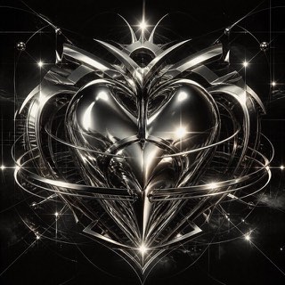
Early 3D software gave this fin-de-millénaire style its chrome, liquid metal, aggressive bevels and lens flare. Dressed in techno and science-fiction imagery, it ruled rave flyers and games magazines around Y2K.
| Luxury Minimal | Metalheart | |
|---|---|---|
| Era | 1990s– | 1995–2004 |
| Family | Contemporary Branding | UI Expression |
| Kind | Style | Style |
| Cues | Vast margins / Refined serifs / Low chroma / Quiet photography | Liquid-metal chrome / Aggressive bevels / Lens flares / Techno and sci-fi typography |
| Best used for | Conveying quality without raising your voice · Making the product or photo the single focus | Club and rave announcements rebuilt with the texture of that era's 3D · Showing off technology through excess instead of refinement |
| Type | High-contrast serif with a small sans | Extrude the letters, bevel them deep, and bake in mirror reflections |
| Composition | One point at the center or edge; margins play the lead | One large object at center, the ground filled with grids and beams |
| Material | Off-white, black, faint textures of stone and cloth | Chrome, liquid metal, lens flare, reflections carrying surrounding color |
| Caution | Tiny type and faint color are not luxury. Being readable comes first. | Polishing it clean in current software removes the rawness that came from the crude renderers of the time, and it becomes something else. |