Kinetic Typography vs Variable Font Design
キネティック・タイポグラフィ / 可変フォント・デザイン
Kinetic Typography comes from Lettering and Variable Font Design from Type Classification. Both are read here as technique. They are reached for with different intent, which is the fastest way to tell them apart.
Kinetic Typography
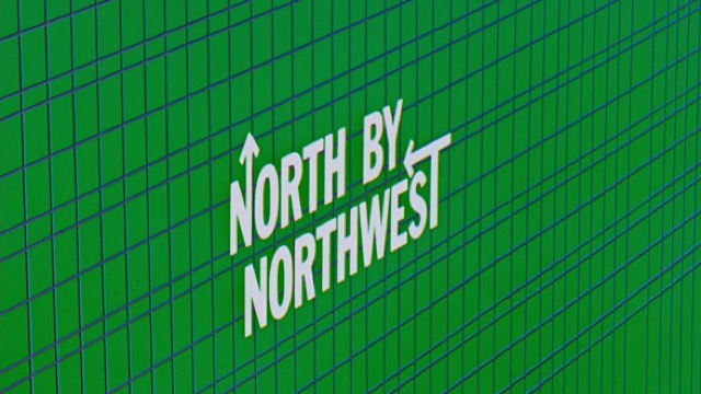
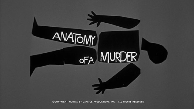
%20-%20Opening%20Crawl.jpg)
Converts the meaning of a word into speed, pause and direction, so that the time of reading is itself designed.
Variable Font Design


Gives one font continuous axes of variation, moving weight, width and slant in response to content and data.
| Kinetic Typography | Variable Font Design | |
|---|---|---|
| Era | film titles–digital motion | 2016– |
| Family | Lettering | Type Classification |
| Kind | Technique | Technique |
| Cues | Per-word motion / Rhythm / Scale change / Pauses | Continuous weights / Variable axes / Data-driven type / Type in motion |
| Best used for | Making a short message physically felt · Carrying the intonation of voice and music to the screen | Covering headline to footnote with one file and a lighter page weight · Letting weight and width move in response to a number or a state |
| Type | One family, varied in weight and width | Design both ends of every axis first, then test the interpolation |
| Composition | Split the sentence into words; assign each a trajectory that fits its meaning | Use the width axis to fit a fixed frame without cutting words |
| Material | Keep the ground quiet; the timing offsets are the star | One file carrying several masters, with safe default values set |
| Caution | Don't move every word. Motion reads because some words stand still. | Every extra axis makes the intermediate shapes more likely to break, so decide what the movement means and how readable the text must stay before the variation becomes the show. |