Genericana vs Industrial Americana
ジェネリカーナ / インダストリアル・アメリカーナ
Genericana comes from Contemporary Branding and Industrial Americana from Industrial and Spatial Design. They are reached for with some of the same intent, which is where they get confused.
Genericana
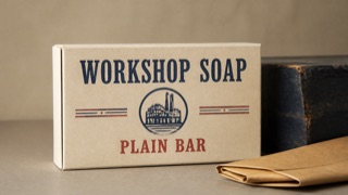
A contemporary brand style that edits 1920s–50s American packaging, sign painting, and factory labels into regionally nonspecific authenticity. Wide space and premium materials turn an imagined old shop into a current upscale product.
Industrial Americana
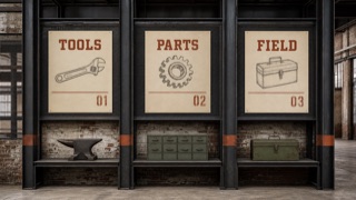
An early-to-mid-1990s style relocating 1940s–60s American clip art, factory printing, and paper-sample graphics into new interiors and graphic systems. It is heavier than Factory Pomo, pairing old labor imagery with rusted beams, mesh, brick, and rough paper.
| Genericana | Industrial Americana | |
|---|---|---|
| Era | mid-1980s–early 2010s | early–mid-1990s |
| Family | Contemporary Branding | Industrial and Spatial Design |
| Kind | Style | Style |
| Cues | Heavy sign-painted type and small origin-like labels / Simplified shields, ribbons, stars, and factory seals / Ecru, navy, red, and kraft-brown limited palettes / One vintage packaging image isolated in broad space | Vintage line art of tools, workers, factories, and transport / Rust, soot black, ecru, and muted green / Heavy slab serifs, wood type, and stencil numbers / Exposed steel, mesh, concrete, and brick |
| Best used for | Giving food, clothing, or household goods an old-shop sense of trust · Unifying packaging and signs as an imagined historic main street | Giving tool, clothing, or food brands industrial weight across paper and space · Distinguishing 1990s adaptive-industrial design from later cafe décor |
| Type | Set the main name in a heavy hand-painted roman or script and surround it with small capitals for place, date, and variety. | Set large slab-serif names and stencil numbers, adding old line art like a product label. |
| Composition | Center one emblem or product image and stack short information symmetrically above and below. | Treat beams and rules as one grid and place each image or product in a large rectangle. |
| Material | Use uncoated paper, embossing, two spot colors, and dark painted wood; confine distressing to edges. | Combine rough stock, black ink, rust color, mesh, steel, and brick; avoid uniform digital distress. |
| Caution | Do not invent a founding year or origin as fact. Separate stylistic quotation from a brand’s documented history. | Bare bulbs and brick alone are contemporary industrial décor. The 1990s print language, American factory imagery, and spatial materials need one identification system. |