Frasurbane vs Utopian Scholastic
フラサーバン / ユートピアン・スコラスティック
Both sit in Publishing and Editing, so the question is not what they belong to but how they behave. They are reached for with different intent, which is the fastest way to tell them apart.
Frasurbane
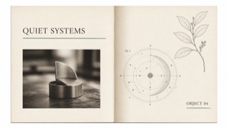
An early-1990s style that quiets grunge disruption for affluent, suburbanized adult publishing and advertising. Serif type, classical illustrations, and soft-focus photography are slightly displaced by underlines and overlap to stage an urbane life.
Utopian Scholastic

A 1990s editorial aesthetic in which encyclopedias, educational CD-ROMs, and science materials trust that the world’s knowledge can be made bright and complete. Classical serif type and specimen photography sit in clean DTP space, cut-out collage, diagrams, and idealized settings.
| Frasurbane | Utopian Scholastic | |
|---|---|---|
| Era | late 1980s–mid-1990s | late 1980s–late 1990s |
| Family | Publishing and Editing | Publishing and Editing |
| Kind | Style | Style |
| Cues | Mixed-weight and italic serif type with long underlines / Classical sculpture, armillary spheres, botanical plates, and old machinery / Sepia or monochrome soft-focus product photography / Textured paper and wide whitespace with small misalignments | Cut-out animals, globes, bodies, sculpture, and instruments on white / Classical serif headings with small sans-serif explanations / Idealized sky, grass, space, and library backgrounds / Figure numbers, boxes, and arrows organizing one screen of knowledge |
| Best used for | 1990s food, travel, home, and finance advertising built around intellectual lifestyle · Editorial work using classical imagery without pretending to be a historical reproduction | Bringing several fields into one explorable entry point for education, science, or museums · Reconstructing 1990s encyclopedias and CD-ROMs through photo collage and type hierarchy |
| Type | Use no more than two serif faces, switching weight and italic, with one long underline as structure. | Pair a classical serif heading with a small humane sans and fix the hierarchy of term, explanation, and figure number. |
| Composition | Separate photographs and classical plates in large fields of whitespace, mixing periods only through partial overlap. | Float one symbolic specimen centrally and surround it radially with smaller images and short explanations. |
| Material | Combine ecru paper, sepia imagery, hairline rules, and one muted green or red accent. | Combine high-resolution cut-outs, pale gradients, and hairlines while retaining the seams of DTP collage. |
| Caution | Classical plates alone make generic vintage editorial. Retain a slight grunge-derived displacement and a restrained suburban polish. | Unrelated stock images erase the knowledge system. Decide which question and hierarchy each image serves before arranging it. |