Fluent 2 vs Material You / Material 3
フルーエント2 / マテリアル・ユー/マテリアル3
Fluent 2 comes from Microsoft UI and Material You / Material 3 from Google UI. Both are read here as style. They are reached for with some of the same intent, which is where they get confused.
Fluent 2
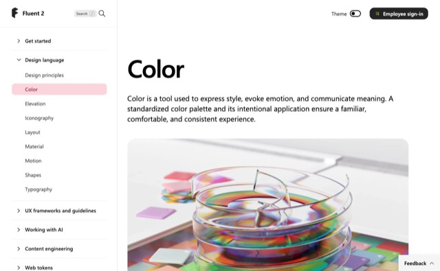


Tokenizes color, type, spacing, radius and depth, deploying Solid, Acrylic, Mica and Smoke materials by role across Microsoft products.
Material You / Material 3

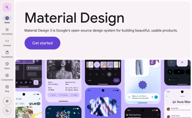

Derives a color system from the user's wallpaper and choices, adapting shape, color, motion and components to the individual.
| Fluent 2 | Material You / Material 3 | |
|---|---|---|
| Era | 2022– | 2021– |
| Family | Microsoft UI | Google UI |
| Kind | Style | Style |
| Cues | Mica and Acrylic / Neutral tonal hierarchy / Soft corner radii / Tokenized depth | Dynamic color / Large corner radii / Personalized themes / Adaptive components |
| Best used for | Business UI at home in Windows and Microsoft 365 that several teams must keep identical · Replacing an existing product in stages so theme and state stay consistent across products | Android apps that honor the user's color choice and keep the palette intact from device to device · Personal tools where choosing the color is what the user owns, and one system stretched across several brands |
| Type | Define size and leading as tokens and never hardcode values in a screen. | Assign text colors by role and keep raw values out of screen code. |
| Composition | Fix spacing to multiples of one base and keep density variants as separate tokens. | Keep corner radii as a scale by role and choose by component size. |
| Material | Mica for the window ground, Acrylic only for surfaces that appear briefly. | Verify contrast in both light and dark for every wallpaper derived palette. |
| Caution | Match blur and shadow to surface role, window state and light, dark and high contrast. Adding one off colors and paddings per screen turns the unifying system into one more thing to maintain. | Pale tints and big radii are not the system, so design color roles, states, accessibility and user driven variation, and keep a brand hue so the app stays recognizable. |