Diner Kitsch vs 70’s Retro
ダイナー・キッチュ / 70年代レトロ
Diner Kitsch comes from Signage and Display and 70’s Retro from Retro. They are reached for with some of the same intent, which is where they get confused.
Diner Kitsch
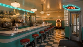
A post-1970s commercial revival compressing 1940s–50s diners, drive-ins, and malt shops into an ideal childhood memory. Chrome, jukeboxes, neon, cars, and rounded lettering matter more than faithful reconstruction of an actual restaurant.
70’s Retro


Builds cheerful nostalgia from thick round shapes and earthy warm color.
| Diner Kitsch | 70’s Retro | |
|---|---|---|
| Era | mid-1970s–early 1990s | 1970s |
| Family | Signage and Display | Retro |
| Kind | Style | Style |
| Cues | Chrome edging, corrugated metal, and red-white or turquoise-white surfaces / Jukeboxes, records, classic cars, and milkshakes / Rounded scripts and boomerang-shaped neon signs / Checker floors, vinyl seats, and long counters | Fat curves / Wave forms / Orange and brown / Repeating stripes |
| Best used for | Using the shared fun of 1950s memory in food, music, or events · Comparing historical diners with later revivals through material and lettering | Warming up food, music and community · A slightly loose, easy joyfulness |
| Type | Set a rounded script in neon or chrome edging and separate prices and menu copy in a plain block face. | Round, heavy display type |
| Composition | Use the counter as a long horizontal axis and place one jukebox or car at the endpoint. | Curvy rhythms and oversized headlines |
| Material | Combine clean chrome, corrugated metal, vinyl, checker tile, and neon. | Orange, ochre, dark brown; a touch of print misregistration |
| Caution | Displaying every 1950s symbol becomes a theme park. Establish eating, ordering, seating, and exit functions first, then choose one period interpretation. | Making everything retro becomes a costume. Keep body text and controls contemporary. |