Corporate Grunge vs Graffiti Pop
コーポレート・グランジ / グラフィティ・ポップ
Corporate Grunge comes from Contemporary Branding and Graffiti Pop from Illustration Styles. They are reached for with some of the same intent, which is where they get confused.
Corporate Grunge
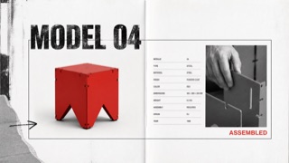
A controlled transfer of distressed type, rupture, and layering from music publishing into corporate advertising and product catalogues. Illegibility is not the goal; traces of rebellion sit around otherwise ordered product information.
Graffiti Pop
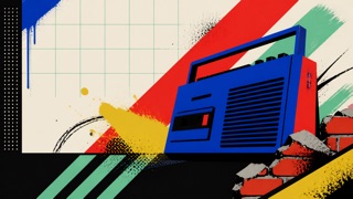
A 1980s–90s commercial style in which advertising, television, toys, and fashion turned graffiti and the contemporary street into a clean, readable urban stage. Separate from writers’ signature culture, it arranged spray lines, brick, chain-link, bins, and boomboxes behind Pop-like products.
| Corporate Grunge | Graffiti Pop | |
|---|---|---|
| Era | late 1980s–mid-1990s | early 1980s–mid-1990s |
| Family | Contemporary Branding | Illustration Styles |
| Kind | Style | Style |
| Cues | Distressed or overprinted display headlines / Tilted subheads alongside orderly body copy / Rough monochrome photography with one red or yellow overprint / Torn edges, hand marks, and copier noise used selectively | Bright spray lines, splatter, and heavy outlines behind products / Brick, chain-link, lamps, sidewalks, and bins compressed into a shallow stage / High-contrast black, white, red, yellow, and turquoise / Hand-drawn headlines above orderly product names and prices |
| Best used for | Youth, sports, and music advertising that needs resistance without sacrificing price or feature information · Editorial work about the commercialization of 1990s underground culture | Critically showing how street culture was converted into a product backdrop in 1980s–90s advertising · Contrasting readable commercial information with drawn motion in fictional urban sets |
| Type | Distress display type only, then restore body copy to one face, alignment, and line length. | Draw only a short fictional headline in a wide hand style; return product, price, and safety copy to an orderly sans. |
| Composition | Lock the product and required information in rectangles; collide cropped photos and drawn marks around them. | Keep the central product or figure clear and use no more than three surrounding layers of brick, mesh, and spray lines. |
| Material | Use crushed photocopy texture, worn paper, coarse halftones, and limited-color overprint locally. | Use flat spot color, rough airbrush, print halftone, and painted plywood without reproducing a real tag or signature. |
| Caution | When everything becomes unreadable, it is simply grunge. Corporate Grunge depends on destruction and legibility remaining visible on the same surface. | Do not imitate a living or historical graffiti writer’s tag, lettering, or mural. Do not reduce poverty and decay to cool urban props; explain the commercializing context. |