Ant Design vs GitHub Primer
Ant Design / GitHub Primer
Both sit in Platform Screen Languages, so the question is not what they belong to but how they behave. They are reached for with some of the same intent, which is where they get confused.
Ant Design
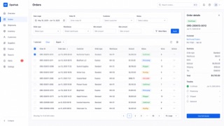
A design system that keeps enterprise web applications at low entropy through reusable components and page patterns. Its values — Natural, Certain, Meaningful and Growing — systematize tables, forms, hierarchy and state without reducing information density.
GitHub Primer


GitHub's design system for turning dense development workflows into shared rules for color, type, icons, spacing and components. It favors flow over decoration, keeping many states and actions in a small area without giving up accessibility or responsive behavior.
| Ant Design | GitHub Primer | |
|---|---|---|
| Era | 2015– | 2017– |
| Family | Platform Screen Languages | Platform Screen Languages |
| Kind | Style | Style |
| Cues | Dense tables set in small type and fine rules / Blue primary actions with explicit semantic colors / Consistent forms, pagination, trees and tables / Readability achieved through alignment and repetition, not generous space | Neutral surfaces with blue links and restrained status colors / Octicons paired with short action labels / Thin borders separating lists, tabs and sidebars / Consistent steps of type and spacing even at high density |
| Best used for | Enterprise admin screens with many tables, forms, permissions and states · Standardizing component behavior and exceptions in international products | Developer SaaS and admin tools that must hold many states and actions on one screen · Keeping information density and accessibility consistent across product teams |
| Type | Keep body text compact and separate labels, values and help text through weight and color. | Use one plain sans for body and labels; build hierarchy through weight and color. |
| Composition | Set table and form columns first; show relationships through alignment rather than extra space. | Separate lists, tabs and sidebars with fine rules and hold spacing to a small token set. |
| Material | Start with white, fine borders and a blue primary action; hold every state color to one meaning. | Start from neutrals; reserve blue for links and semantic colors for success, warning and danger. |
| Caution | A component catalog dropped onto a page can look orderly while leaving the actual workflow undesigned. | Adding borders and tiny controls to look like GitHub only creates a cramped admin screen when the work has no clear priority. |