Shōjo Manga vs Webtoon (Vertical-Scroll Comics)
少女漫画 / ウェブトゥーン(縦スクロール漫画)
Shōjo Manga comes from Illustration Styles and Webtoon (Vertical-Scroll Comics) from Reading on the Web. One is style and the other layout. They are reached for with some of the same intent, which is where they get confused.
Shōjo Manga
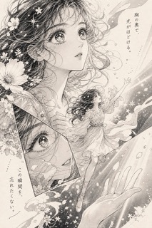
A field that built its own grammar for translating psychology into space. Panels are broken open, flowers and stars scatter across the background, and the inner voice runs out into the margins. The large eyes and the overlaid panels are devices for drawing the flow of feeling rather than the flow of time.
Webtoon (Vertical-Scroll Comics)

A comics layout that grew on Korean portals and runs down a single column. The blank space between panels stops being a mere break and becomes the material, because its length carries elapsed time or a change of scene while it also takes on background colour, falling rain, and even the dialogue lifted out of the frames. Since the reader cannot glance ahead, the act of scrolling becomes the passage of story time.
| Shōjo Manga | Webtoon (Vertical-Scroll Comics) | |
|---|---|---|
| Era | 1950s– | 2003– |
| Family | Illustration Styles | Reading on the Web |
| Kind | Style | Layout |
| Cues | Figures and panels that cross the frame / Flowers and light streaming through the background / Eyes drawn large and worked in detail / Monologue spilling into the margins | Panels line up in a single vertical column, with nowhere for the eye to move sideways / The blank between panels runs longer than the panels themselves and holds background colour, falling rain, or dialogue / A single panel roughly eight times taller than it is wide, needing several scrolls before it can be seen whole / Full colour from the outset, drawn to one fixed width matched to the screen |
| Best used for | Drawing the flow of feeling in space rather than in time · Letting inner monologue share the page with the image | Building a story to be read by scrolling, where pacing is designed as lengths of blank space rather than as page turns · Staging a fall or a dive where the point is to stretch out the reader's own reading time |
| Type | Let hand lettering and monologue run into the white space outside the panels. | Dialogue does not have to stay inside the frame, so push it into the blank. Separating narration from speech that way pulls the narrator apart from the character. |
| Composition | Overlap panels and place figures breaking through the frame lines. | Fix the width and extend only downward. Give a long pause a long blank and a tense passage a run of short ones, so the unit of division is the height of the gap rather than the page. |
| Material | Make light by layering screentone and cutting out white. | Assume full colour throughout and let the background colour of the gaps set the mood of an episode. Pour a repeating image such as rain or a falling body through the blanks until the edge between gap and panel dissolves. |
| Caution | Borrowing the eyes and the flowers ends in mere signs. The structure of the panels is what carries the emotion. | Stacking print page layouts one under another turns the blanks back into meaningless slack and disables the pacing mechanism that sits at the centre of the form. |