OS/2 Workplace Shell vs Windows 95 Interface
OS/2 Workplace Shell / Windows 95 インターフェース
OS/2 Workplace Shell comes from Platform Screen Languages and Windows 95 Interface from Microsoft UI. They are reached for with some of the same intent, which is where they get confused.
OS/2 Workplace Shell
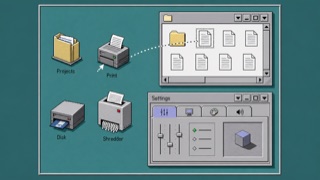
OS/2 treated folders, printers, drives and settings as operable objects rather than loose icons. Dimensional borders, shaded icons, Notebook settings and direct drag-and-drop made the whole desktop one object-oriented workplace.
Windows 95 Interface


The screen language Microsoft set down in its 1995 handbook for software design. Gray panels are carved with a doubled outer and inner edge, so the direction of the shadow alone says what can be pressed. A bar sits permanently along the bottom, and every application is assembled from the same system parts.
| OS/2 Workplace Shell | Windows 95 Interface | |
|---|---|---|
| Era | 1992–2001 | 1995–2001 |
| Family | Platform Screen Languages | Microsoft UI |
| Kind | Style | Style |
| Cues | Pale gray surfaces with double light and dark dimensional edges / Low-color object icons drawn from an oblique view / Notebook settings with stacked edge tabs / Direct dragging among folders, shredder and drives | Gray panels framed by a doubled edge, one light line and one dark line, outside and inside / A bar pinned to the bottom of the screen with a single square button at its left end / A flat navy title bar with three small squares grouped at its right end / Small bitmap text with no antialiasing, one letter underlined to mark the keyboard shortcut |
| Best used for | Handling files, devices and settings as one environment of related objects rather than separate applications · Reconstructing a 1990s work desktop from its object model instead of window decoration | Laying out a list or settings screen for business software at a fixed pixel size that never has to scale · Rebuilding the look of a 1990s personal computer for an exhibition or a video |
| Type | Use a small system sans and keep object names to one line directly below their icons. | Set a bitmap sans at its native size with antialiasing off. Use one size, reserve bold for emphasis, and underline the single shortcut letter. |
| Composition | Use the desktop as a base, overlap folder windows, and gather settings into a multi-tab Notebook. | Split the screen into a permanent bottom bar and a work area. Pack controls about four pixels apart, and put confirm and cancel in a row at the lower right of a dialog. |
| Material | Layer light upper-left and dark lower-right edges on middle gray, giving icons limited color and small shadows. | Carve everything from four values: the gray face, a white highlight, a mid gray shadow, a black outline. Build relief from an outer and an inner line, and swap light for dark on press. |
| Caution | Old icons and 3D buttons are not enough. Every part must behave as a directly operable, related object. | Copy the gray and the doubled line but add rounded corners or soft shadows, and the direction of the carving stops reading, taking the hardness that defined the original with it. |