Neubrutalism vs Neumorphism
ニューブルータリズム / ニューモーフィズム
Both sit in UI Expression, so the question is not what they belong to but how they behave. They are reached for with different intent, which is the fastest way to tell them apart.
Neubrutalism
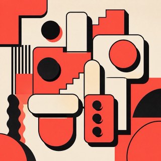
Rebels warmly against the over-polished web with thick borders and blunt color.
Neumorphism


Makes background and controls one material, showing relief through soft shadow alone.
| Neubrutalism | Neumorphism | |
|---|---|---|
| Era | 2010s– | late 2010s– |
| Family | UI Expression | UI Expression |
| Kind | Style | Style |
| Cues | Thick black borders / Hard shadows / Vivid color / Flat components | Same-color surfaces / Two-direction shadows / Rounded parts / Low contrast |
| Best used for | Making a product frank and memorable · Humanity for communities and creator tools | Concept screens with few interactions · A soft, quiet product impression |
| Type | Bold sans, monospace | A concise sans-serif |
| Composition | Divide into clear boxes; shadows in one direction | Big margins, few controls |
| Material | Off-white plus vivid color, black borders, few rounded corners | Pale ground, one light and one dark shadow, rounded corners |
| Caution | Don't border and shadow everything. Vary the strength by hierarchy. | Contrast failure comes easily. Mark key actions and states with color and outline too. |