Material Design vs Skeleton Screen
マテリアルデザイン / スケルトン・スクリーン
Material Design comes from Google UI and Skeleton Screen from UI Expression. One is style and the other technique. They are reached for with some of the same intent, which is where they get confused.
Material Design


A design system that reduces the physical metaphor of paper and ink to rules of shadow and overlap. Elements are given elevation, shadow states the hierarchy, and motion carries physical cause and effect. It became the model for UI design being distributed as a system. The 2021 revision added colour derived from the device wallpaper, so the palette differs from one user to the next.
Skeleton Screen
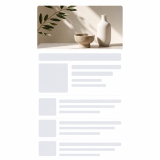
A loading treatment that drops the spinner and shows a blank version of the page instead, then fills information into it as the data arrives. Luke Wroblewski named the technique in 2013, writing about his own app Polar, where a spinner had made testers report that the app felt slower than the previous version. The aim is to show advance toward the goal rather than the act of waiting.
| Material Design | Skeleton Screen | |
|---|---|---|
| Era | 2014– | 2013– |
| Family | Google UI | UI Expression |
| Kind | Style | Technique |
| Cues | Hierarchy and shadow expressed by elevation / Surfaces overlapping like sheets of paper / Motion that shows cause and effect / A standardized unit of spacing | No spinner and no progress bar while the screen loads / Blank fields already standing where text and images will land, at the size they will occupy / A layout committed before the data arrives, so nothing shifts when it does / Regions filling in one after another instead of the whole screen appearing at once |
| Best used for | Distributing consistent behavior across several platforms · Communicating the depth of a hierarchy visually | Replacing the spinner on the first load of a list or timeline to raise perceived speed · Fixing a screen where elements jump as data lands, by committing position and size in advance |
| Type | Build the hierarchy from one type family and separate levels by weight and size. | Set no type at all. Where headings and body will go, lay blank fields matched to the real line height and measure. |
| Composition | Place elements on a grid of multiples of 8 and standardize the spacing. | Reuse the finished screen's skeleton. Commit every position and dimension first so nothing moves once the content lands. |
| Material | Give surfaces elevation and show front and back by the density of the shadow. | Use neutral fields one step away from the background. Match corner radius and size to the real elements and add no further colour. |
| Caution | Do not add shadow as decoration. The moment the elevation rules break, the hierarchy is telling a lie. | If the blank fields do not match the real content's dimensions, everything shifts the moment data lands, which reads worse than the spinner it replaced. |