Kinetic Typography vs Manga Lettering
キネティック・タイポグラフィ / 漫画の描き文字
Both sit in Lettering, so the question is not what they belong to but how they behave. One is technique and the other style. They are reached for with some of the same intent, which is where they get confused.
Kinetic Typography
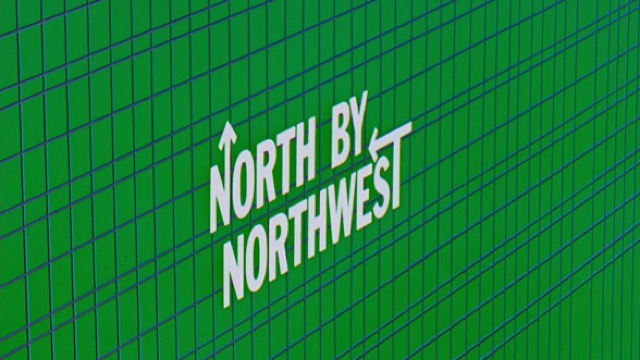
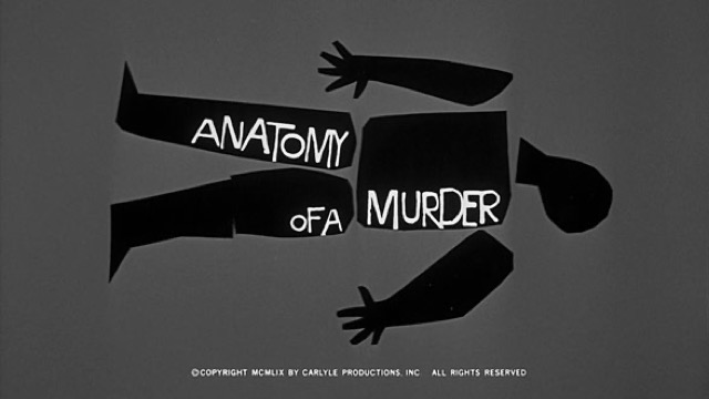
%20-%20Opening%20Crawl.jpg)
Converts the meaning of a word into speed, pause and direction, so that the time of reading is itself designed.
Manga Lettering


%E2%80%99%20by%20Okamoto%20Ippei%2C%20Honolulu%20Museum%20of%20Art.jpg)
In Japanese manga, sound effects and even the feel of silence are drawn as pictures, from a booming don to a hushed shiin. Hand-lettering turns the texture of a sound into line weight and shape, dissolving the border between image and word inside the panel.
| Kinetic Typography | Manga Lettering | |
|---|---|---|
| Era | film titles–digital motion | 1930s– |
| Family | Lettering | Lettering |
| Kind | Technique | Style |
| Cues | Per-word motion / Rhythm / Scale change / Pauses | Sound drawn as shape / Weight matched to texture / Placement crossing panels / Even silence written (shiin) |
| Best used for | Making a short message physically felt · Carrying the intonation of voice and music to the screen | Comics and paneled ads where sound must be written inside the picture · Still images given the flow of time without captions or balloons |
| Type | One family, varied in weight and width | Line weight and edge shape carry the hardness of the sound |
| Composition | Split the sentence into words; assign each a trajectory that fits its meaning | Lettering straddling panel borders and figures, following the reading path |
| Material | Keep the ground quiet; the timing offsets are the star | Written with the same pen as the art, reversed white against solid black |
| Caution | Don't move every word. Motion reads because some words stand still. | Setting sound effects in a ready-made typeface keeps the hardness and speed out of the line, leaving a note floating above the drawing. |