Postwar Japanese Poster vs Shōwa Modern
戦後日本のポスターデザイン / 昭和モダン
Postwar Japanese Poster comes from Regional Graphics and Shōwa Modern from Advertising Posters. Both are read here as style. They are reached for with some of the same intent, which is where they get confused.
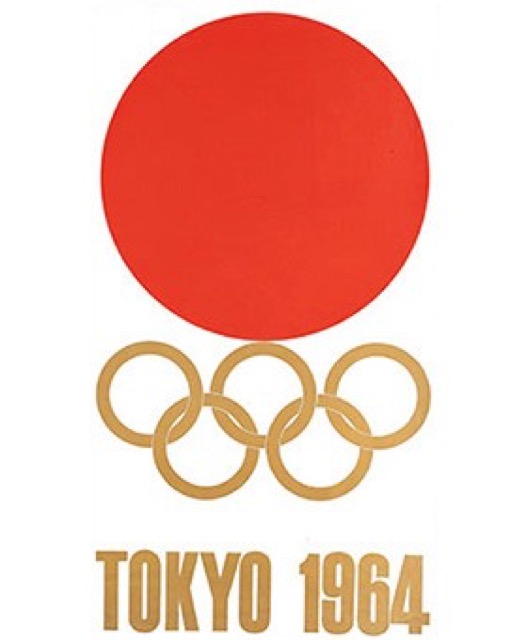
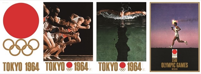
Postwar Japanese Poster
.jpg)
Photography, flat color, calligraphy and traditional motifs, recomposed differently by each designer.
Shōwa Modern


Prewar Japan's commercial modernism, typified by Sugiura Hisui's Mitsukoshi and subway posters: Deco crossed with nihonga, the modern girl's city and refined lettering drawing the dawn of consumer culture.
| Postwar Japanese Poster | Shōwa Modern | |
|---|---|---|
| Era | 1950s–1990s | 1920s–1930s |
| Family | Regional Graphics | Advertising Posters |
| Kind | Style | Style |
| Cues | Bold flatness / Photography and calligraphy / Personal symbols / Precise construction | Deco crossed with nihonga / The modern girl's city / Stylized lettering / Department stores and transit |
| Best used for | Announcing an exhibition or a cultural program with one image and little copy · Setting mixed Japanese and Latin text precisely so it reads as high grade | Department store and event bills selling a city mood, not merchandise · Rail and tourism advertising that must carry the lift of going out |
| Type | Tighten Japanese text into a block and divide roles between calligraphy and type | Kana stylized and thickened, set vertically without Latin mixed in |
| Composition | Run a central axis, fix the margins, then cut down to a few elements | A figure cropped to the torso, background ordered by geometric bands |
| Material | Flat printed color, photographic tone, the white of the paper, few inks laid heavily | Flat color holding nihonga pigment murk, contours tightened by thin line |
| Caution | Placing traditional motifs is only borrowing. Do not flatten the work into one Japanese look, and check how construction differs by designer, decade and advertised subject. | Setting Deco ornament beside a kimono without the newness that city once had produces a period costume rather than a modern poster. |