Isotype vs Scrollytelling
アイソタイプ / スクロールテリング
Isotype comes from Information Design and Scrollytelling from Reading on the Web. They are reached for with some of the same intent, which is where they get confused.
Isotype


Translates quantity into repeated same-size symbols, making comparison readable before language.
Scrollytelling
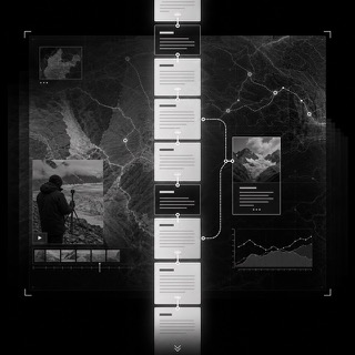
A web page form in which the reader's scroll position is the clock of the story, with graphics, maps and video changing as the page moves and reversing when the reader scrolls back. Visualization researchers treat it as the web equivalent of long form journalism and describe its structure as either linear or elastic, the elastic kind letting a reader dive deeper on demand. News outlets including the New York Times, the BBC and The Economist built the form out.
| Isotype | Scrollytelling | |
|---|---|---|
| Era | 1920s–1940s | 2012– |
| Family | Information Design | Reading on the Web |
| Kind | Layout | Layout |
| Cues | Unified pictograms / Repetition of signs / Axes of comparison / Restricted color | A graphic that holds still on screen while a single narrow column of text passes over it / Changes made by opacity and by moving a map, so that scrolling back undoes them in the same order / Photography, video and data visualization sharing one article / A path that is either straight through or branches into an optional deeper detour and returns |
| Best used for | Statistics comparable without expertise · Basic guidance and education across languages | Laying out an investigation or a research explainer as one page where the graphic holds and only the text moves · Giving a long read on a phone a way to advance that needs no instructions |
| Type | Short labels and clear figures; prose stays outside the chart | Keep the body in one column. The scroll sets the pace, not the page, so hold the measure narrow and place headings only at joints in the story. |
| Composition | Fix the unit per symbol; show change by count, never by size | Pin the graphic and let the text pass over it. How many paragraphs you assign to one graphic is the pacing. |
| Material | Few meaningful colors, equal line weights, aligned baselines | Build only changes that can run backwards, such as opacity crossfades and map moves, each tied one to one with scroll distance. |
| Caution | Never scale one big symbol to show a difference. Always show unit, base and source. | Tying a one shot animation to the scroll leaves a reader who scrolls back looking at nothing, and makes the middle of the article impossible to reread. |