Hurufiyya vs Khartoum School
フルーフィーヤ / ハルツーム派
Both sit in Modern and Contemporary Art Movements, so the question is not what they belong to but how they behave. They are reached for with some of the same intent, which is where they get confused.
Hurufiyya
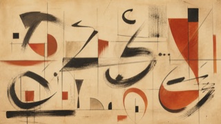
From the mid-twentieth century, Hurufiyya transformed Arabic words, fragments and individual letters into elements of modern painting, sculpture and graphic composition rather than reproducing traditional calligraphy. Letters move among meaning, bodily mark, cultural identity and abstract form.
Khartoum School
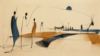
In post-independence Sudan, the fluid and contested Khartoum School recombined African, Islamic, Arab and Western references within modern art. Arabic calligraphic rhythm, simplified people and animals, local craft and narrative moved into abstraction.
| Hurufiyya | Khartoum School | |
|---|---|---|
| Era | mid-20th century– | 1960s–1970s |
| Family | Modern and Contemporary Art Movements | Modern and Contemporary Art Movements |
| Kind | Style | Style |
| Cues | Repeated single Arabic letters or partly unreadable fragments / Writing embedded in grids, spirals, color fields or figures / Hand pressure coexisting with modern abstract composition / Deliberate switching between legibility and pure form | Arabic writing transforming into human, animal and abstract contours / Groups of elongated bodies and mask-like faces / Wide space and line in ink, earth color, blue and white / Local craft and story sharing a field with modern painting |
| Best used for | Treating language, displacement and belonging as tension between readable text and abstraction · Using Arabic script as the structure that carries both meaning and form rather than as scenery | Treating several cultural belongings as transformations of line and figure rather than one fixed emblem · Rereading writing, story, craft and modern painting in relation to post-independence society |
| Type | Verify the letter, word, dialect and writer, and state where reading ends and formal transformation begins. | When using Arabic, verify word and writer and leave the transition from text to person or animal visible. |
| Composition | Do not contain writing in a decorative strip; repeat or break it across the main structure of grid, field, body and void. | Place elongated forms in groups across broad space, keeping repeated line ambiguous among writing, body and horizon. |
| Material | Preserve resistance specific to ink, oil, paper or metal and do not substitute randomly rotated fonts for a physical hand. | Keep the absorption of ink, earth pigment, paper and cloth and resist cleaning every edge into a uniform vector line. |
| Caution | Arabic-looking signs used as exotic pattern erase both meaning and lineage. Distinguish the movement from traditional calligraphy and name maker, region, language and modern context. | It was neither a monolithic look nor one uncontested national identity. Preserve differences among artists and debates around the name instead of generalizing it as African calligraphy. |