Grunge vs Swiss Punk Typography
グランジ / スイス・パンク・タイポグラフィ
Grunge comes from Counterculture and Swiss Punk Typography from Experimental Typography. They are reached for with some of the same intent, which is where they get confused.
Grunge
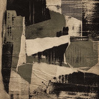
Uses dirt, tears and wear as resistance to the neatly managed screen.
Swiss Punk Typography


In Basel, the home of Swiss style, Weingart took the grid apart from the inside. Exploded letterspacing, stepped settings and layered film exposures turned rebellion within discipline into New Wave typography.
| Grunge | Swiss Punk Typography | |
|---|---|---|
| Era | 1990s | 1970s–1980s |
| Family | Counterculture | Experimental Typography |
| Kind | Style | Style |
| Cues | Scuffing / Tears / Disordered type / Low-quality copies | The grid dismantled / Exploding letterspacing / Stepped compositions / Layered-film textures |
| Best used for | Body heat for music and street culture · Deliberately breaking the look of a finished product | Announcements for experimental music and art that show the discipline breaking · School and studio publications where the method itself is the subject |
| Type | Decayed sans, typewriter faces | Letterspacing opened in steps, one word repeated at several sizes |
| Composition | Overlap and crop; keep alignment only in places | Keep the grid visible while stepping the lines, measuring every offset |
| Material | Dirty paper, grain, low chroma plus one accent | Layered exposures building halftone and reversal through the film |
| Caution | Texture overlays alone feel dated. Run the logic of wear through photo, type and margin alike. | Breaking a grid you never built leaves the offsets nothing to measure against, so the rebellion within discipline never happens and only mess remains. |