GitHub Primer vs GitLab Pajamas
GitHub Primer / GitLab Pajamas
Both sit in Platform Screen Languages, so the question is not what they belong to but how they behave. They are reached for with some of the same intent, which is where they get confused.
GitHub Primer


GitHub's design system for turning dense development workflows into shared rules for color, type, icons, spacing and components. It favors flow over decoration, keeping many states and actions in a small area without giving up accessibility or responsive behavior.
GitLab Pajamas
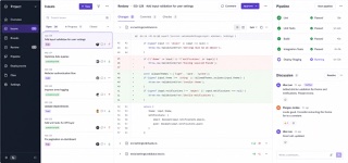
GitLab's screen language connects code, issues, review, CI/CD and security inside one DevSecOps product through GitLab Sans and Mono, persistent navigation, dense lists and a purple-inflected neutral palette.
| GitHub Primer | GitLab Pajamas | |
|---|---|---|
| Era | 2017– | 2018– |
| Family | Platform Screen Languages | Platform Screen Languages |
| Kind | Style | Style |
| Cues | Neutral surfaces with blue links and restrained status colors / Octicons paired with short action labels / Thin borders separating lists, tabs and sidebars / Consistent steps of type and spacing even at high density | GitLab Sans paired with GitLab Mono for code / Layered structure built from left navigation and application chrome / Dense issue, merge-request and pipeline lists / White or charcoal surfaces with purple as brand focus |
| Best used for | Developer SaaS and admin tools that must hold many states and actions on one screen · Keeping information density and accessibility consistent across product teams | Products spanning code through deployment · Reading long identifiers, status, diffs and actions across light and dark themes |
| Type | Use one plain sans for body and labels; build hierarchy through weight and color. | Use GitLab Sans for interface copy and GitLab Mono for branches, commit IDs and code, centered on weights 400 and 600. |
| Composition | Separate lists, tabs and sidebars with fine rules and hold spacing to a small token set. | Keep application chrome stable and open main and supporting panels according to the current work. |
| Material | Start from neutrals; reserve blue for links and semantic colors for success, warning and danger. | Model depth with neutrals, reserve purple for brand affinity, and assign blue, red and green to stable action and status meanings. |
| Caution | Adding borders and tiny controls to look like GitHub only creates a cramped admin screen when the work has no clear priority. | Orange and the tanuki do not make a screen Pajamas. Preserve hierarchy when code, status and discussion share the same view. |