Fluent 2 vs Material Design
フルーエント2 / マテリアルデザイン
Fluent 2 comes from Microsoft UI and Material Design from Google UI. They are reached for with some of the same intent, which is where they get confused.
Fluent 2
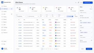
Tokenizes color, type, spacing, radius and depth, deploying Solid, Acrylic, Mica and Smoke materials by role across Microsoft products.
Material Design


A design system that reduces the physical metaphor of paper and ink to rules of shadow and overlap. Elements are given elevation, shadow states the hierarchy, and motion carries physical cause and effect. It became the model for UI design being distributed as a system. The 2021 revision added colour derived from the device wallpaper, so the palette differs from one user to the next.
| Fluent 2 | Material Design | |
|---|---|---|
| Era | 2022– | 2014– |
| Family | Microsoft UI | Google UI |
| Kind | Style | Style |
| Cues | Mica and Acrylic / Neutral tonal hierarchy / Soft corner radii / Tokenized depth | Hierarchy and shadow expressed by elevation / Surfaces overlapping like sheets of paper / Motion that shows cause and effect / A standardized unit of spacing |
| Best used for | Business UI at home in Windows and Microsoft 365 that several teams must keep identical · Replacing an existing product in stages so theme and state stay consistent across products | Distributing consistent behavior across several platforms · Communicating the depth of a hierarchy visually |
| Type | Define size and leading as tokens and never hardcode values in a screen. | Build the hierarchy from one type family and separate levels by weight and size. |
| Composition | Fix spacing to multiples of one base and keep density variants as separate tokens. | Place elements on a grid of multiples of 8 and standardize the spacing. |
| Material | Mica for the window ground, Acrylic only for surfaces that appear briefly. | Give surfaces elevation and show front and back by the density of the shadow. |
| Caution | Match blur and shadow to surface role, window state and light, dark and high contrast. Adding one off colors and paddings per screen turns the unifying system into one more thing to maintain. | Do not add shadow as decoration. The moment the elevation rules break, the hierarchy is telling a lie. |