Flat Design / Vector Minimalism vs Skeleton Screen
フラットデザイン / ベクターミニマリズム / スケルトン・スクリーン
Both sit in UI Expression, so the question is not what they belong to but how they behave. One is style and the other technique. They are reached for with some of the same intent, which is where they get confused.
Flat Design / Vector Minimalism


Reduces information to plain planes and color, portable across screens and media.
Skeleton Screen
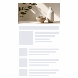
A loading treatment that drops the spinner and shows a blank version of the page instead, then fills information into it as the data arrives. Luke Wroblewski named the technique in 2013, writing about his own app Polar, where a spinner had made testers report that the app felt slower than the previous version. The aim is to show advance toward the goal rather than the act of waiting.
| Flat Design / Vector Minimalism | Skeleton Screen | |
|---|---|---|
| Era | 2010s– | 2013– |
| Family | UI Expression | UI Expression |
| Kind | Style | Technique |
| Cues | Uniform planes / Simple shapes / Few shadows / Clear color | No spinner and no progress bar while the screen loads / Blank fields already standing where text and images will land, at the size they will occupy / A layout committed before the data arrives, so nothing shifts when it does / Regions filling in one after another instead of the whole screen appearing at once |
| Best used for | Light, understandable explanation · Large sets of consistent figures | Replacing the spinner on the first load of a list or timeline to raise perceived speed · Fixing a screen where elements jump as data lands, by committing position and size in advance |
| Type | A rounded sans-serif | Set no type at all. Where headings and body will go, lay blank fields matched to the real line height and measure. |
| Composition | Simple silhouettes and clear hierarchy | Reuse the finished screen's skeleton. Commit every position and dimension first so nothing moves once the content lands. |
| Material | Three to five colors; shadows only when they mean something | Use neutral fields one step away from the background. Match corner radius and size to the real elements and add no further colour. |
| Caution | Figures easily become generic. Define your own ratios, lines and color rules. | If the blank fields do not match the real content's dimensions, everything shifts the moment data lands, which reads worse than the spinner it replaced. |