Emigre vs Grunge
エミグレ / グランジ
Emigre comes from Type Classification and Grunge from Counterculture. They are reached for with some of the same intent, which is where they get confused.
Emigre


.svg)
The magazine and foundry that turned digital coarseness into an aesthetic the moment the Mac appeared: bitmap faces, colliding layers and a defense of difficulty at the center of the 1990s design debates.
Grunge
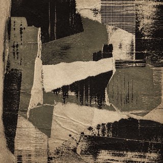
Uses dirt, tears and wear as resistance to the neatly managed screen.
| Emigre | Grunge | |
|---|---|---|
| Era | 1984–2005 | 1990s |
| Family | Type Classification | Counterculture |
| Kind | Style | Style |
| Cues | Bitmap typefaces / Colliding layers / An experiment per issue / Challenges to readability | Scuffing / Tears / Disordered type / Low-quality copies |
| Best used for | Magazines and specimens about type itself, rebuilt from scratch each issue · Low-resolution screens shown as a character rather than a defect | Body heat for music and street culture · Deliberately breaking the look of a finished product |
| Type | Pixel stepping enlarged, not smoothed, several unlike faces on a page | Decayed sans, typewriter faces |
| Composition | The grid discarded each issue, text and image layered over each other | Overlap and crop; keep alignment only in places |
| Material | Screen coarseness carried into print, paper white treated as glow | Dirty paper, grain, low chroma plus one accent |
| Caution | Making difficulty the goal drains away the argument that once made it an experiment, leaving only a page where information fails to arrive. | Texture overlays alone feel dated. Run the logic of wear through photo, type and margin alike. |