Canonical Vanilla vs GitHub Primer
Canonical Vanilla / GitHub Primer
Both sit in Platform Screen Languages, so the question is not what they belong to but how they behave. They are reached for with some of the same intent, which is where they get confused.
Canonical Vanilla
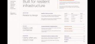
Canonical's CSS-based screen language unifies Ubuntu, MAAS, Juju and related sites and applications through Ubuntu type, split grids, ruled sections and generous space, optimized for scanning long technical content.
GitHub Primer


GitHub's design system for turning dense development workflows into shared rules for color, type, icons, spacing and components. It favors flow over decoration, keeping many states and actions in a small area without giving up accessibility or responsive behavior.
| Canonical Vanilla | GitHub Primer | |
|---|---|---|
| Era | 2013– | 2017– |
| Family | Platform Screen Languages | Platform Screen Languages |
| Kind | Style | Style |
| Cues | Thin large headings paired with bold smaller headings in Ubuntu type / Asymmetric 25/75 and 50/50 splits / Fine rules above sections and generous vertical space / White surfaces, dark text and orange or aubergine focus | Neutral surfaces with blue links and restrained status colors / Octicons paired with short action labels / Thin borders separating lists, tabs and sidebars / Consistent steps of type and spacing even at high density |
| Best used for | Technical product sites whose long copy must be scanned rapidly by heading · Sharing one typography and sectional rhythm across Canonical product sites and admin apps | Developer SaaS and admin tools that must hold many states and actions on one screen · Keeping information density and accessibility consistent across product teams |
| Type | Use Ubuntu Variable with light display headings and bold small headings and UI labels. | Use one plain sans for body and labels; build hierarchy through weight and color. |
| Composition | Divide an eight- or twelve-column grid in 25-percent units, putting short headings left and longer content right; rule the section tops. | Separate lists, tabs and sidebars with fine rules and hold spacing to a small token set. |
| Material | Start from white space and dark text, using orange or aubergine only for links, focus and brand moments. | Start from neutrals; reserve blue for links and semantic colors for success, warning and danger. |
| Caution | Ubuntu type alone does not make Vanilla. Keep the quarter-based splits and the reading rhythm between sections consistent too. | Adding borders and tiny controls to look like GitHub only creates a cramped admin screen when the work has no clear priority. |