Breeze vs Ubuntu Yaru
ブリーズ / Ubuntu Yaru
Both sit in Platform Screen Languages, so the question is not what they belong to but how they behave. They are reached for with some of the same intent, which is where they get confused.
Breeze


The default visual style KDE introduced with Plasma 5, described in its own announcement as a high contrast, flat theme for the workspace. Graphics assets are simpler and more monochromatic, and layouts lean on typography rather than ornament so elements stay recognisable. Light and dark variants shipped as a matched pair from the beginning.
Ubuntu Yaru
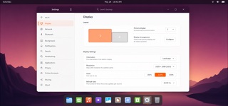
Ubuntu's community-built default theme overlays Adwaita-based GTK and GNOME Shell with Ubuntu orange, dark header bars and Suru-derived icons, distributing windows, shell, icons, cursors and sound as one suite.
| Breeze | Ubuntu Yaru | |
|---|---|---|
| Era | 2014– | 2018– |
| Family | Platform Screen Languages | Platform Screen Languages |
| Kind | Style | Style |
| Cues | Flat surfaces with no modelled shading, where edges are carried by contrast alone / Icons and graphic assets reduced toward monochrome, with a tight colour count / Type contrast doing the work ornament would otherwise do, so layout reads through text / The same assets existing as a matched light and dark pair | Light window body contrasted with a dark header bar / Ubuntu orange for selection and focus / Suru-derived icons based on circles, squares and vertical or horizontal oblongs / One-pixel icon edge, restrained gradient and lower shadow |
| Best used for | Making a Linux desktop application sit naturally inside the default workspace appearance · Setting the look of an admin interface that has to ship light and dark as a matched pair from day one | Unifying the Ubuntu desktop, default applications and distribution assets · Adding a distribution identity while remaining compatible with upstream GNOME |
| Type | Let type carry the hierarchy. Open a wide gap in size and weight between heading and body, and never separate them with ornament. | Use Ubuntu type and short labels; avoid lettering inside icons. |
| Composition | Divide regions with space and thin rules rather than stacked frames or shadows. Keep the arrangement plain so visual clutter drops. | Preserve GTK structure, using the dark header and orange focus ring to declare the active window. |
| Material | Build on flat fields with no shading or gloss and hold the palette near monochrome. Push contrast hard, then derive light and dark from the same assets. | Reuse the Suru palette, restrained gradients and translucent dark outlines to keep icons from drifting apart. |
| Caution | Softening the contrast breaks the premise, because a flat surface has nothing but contrast left to separate one element from the next. | Large overrides of Adwaita collide with application styling. Contain Ubuntu identity in color, headers and iconography instead of restructuring widgets. |